 seolounge

There’s been a lot of information come out about Google’s mobile-first indexing over the last several years — so much that it can be difficult to keep up.
In this post, you’ll learn about recent updates and what Google is looking for in mobile usability, what it means to have an identical experience on mobile and desktop, how you can meet Google’s expectations of mobile-first best practices, and more.
The following is a compilation of things we know about Google’s mobile-first indexing.
First Things First: There is No Separate Index for Mobile
Google has stated that there isn’t a separate mobile-first index.
Instead, mobile-first indexing means Google primarily uses the mobile version of the webpage for ranking and indexing purposes.
In 2018, Google explained that with mobile-first indexing, the URL of the mobile-friendly version of your site is indexed.
If your website has separate mobile and desktop URLs, Google shows the mobile URL to mobile users and the desktop URL to desktop users.
Advertisement
Continue Reading Below
Regardless, the indexed content will be the mobile version.
Mobile-First Indexing Rollout
At the end of 2017, Google announced that it would start slowly rolling out mobile-first indexing. By March 2018, Google stated that they were expanding the rollout and instructed websites to prepare.
Fast forward three years later and not all websites have been switched over to the mobile index. In June 2020, Google stated that while most websites were set to mobile indexing, there were still many that were not.
Google announced at that point that instead of switching on September 2020, it would delay mobile-first indexing until March 2021.
Google cited a number of issues encountered with sites as a reason for delaying the rollout, including problems with robots meta tags, lazy-loading, blocked assets, primary content, and mobile images and videos.
However, John Mueller, Google Search Advocate, later said it could take the team longer than the March 2021 date to get all sites moved over.
Mobile-First Indexing Applied to New Websites by Default
If your website was published after July 1, 2019, mobile-first indexing is enabled by default.
Advertisement
Continue Reading Below
Google made this announcement in May 2019 and explained that the change applied to websites that were previously unknown to Google Search.
The announcement went into detail about why Google would make mobile-first indexing the default for new websites.
According to Google, after crawling the web with a smartphone Googlebot over the years, they concluded that new websites are typically ready for this type of crawling.
Mobile Usability is Not the Same as Mobile-First Indexing
In January 2019, Mueller explained that if your content does not pass the mobile usability test, it could still be moved to mobile-first indexing.
Even if Search Console’s “mobile usability” report showed that your site had valid URLs, it didn’t mean those pages were ready for mobile-first indexing.
Mobile usability is “completely separate” from mobile-first indexing, according to Mueller. Consequently, pages could be enabled for mobile-first indexing even if they were not considered usable on a mobile device.
You can hear Mueller’s explanation in the video below, starting at the 41:12 mark:
“So, first off, again mobile usability is completely separate from mobile-first indexing.
A site can or cannot be usable from a mobile point of view, but it can still contain all of the content that we need for mobile-first indexing.
An extreme example, if you take something like a PDF file, then on mobile that would be terrible to navigate. The links will be hard to click, the text will be hard to read.
But all of the text is still there, and we could perfectly index that with mobile-first indexing.
Mobile usability is not the same as mobile-first indexing.”
In summary, mobile-friendliness and mobile-responsive layouts are not mandatory for mobile-first indexing.
Since pages without mobile versions still work on a mobile device, they were eligible for indexing.
Websites Should Provide the Same Experience on Mobile & Desktop
Google added to their mobile-first indexing best practices in January 2020 and the big emphasis was on providing an identical experience on mobile and desktop.
Advertisement
Continue Reading Below
Matt Southern provided a great summarized list of what Google meant by the same experience:
- Ensuring Googlebot can access and render mobile and desktop page content and resources.
- Making sure the mobile site contains the same content as the desktop site.
- Using the same meta robots tags on the mobile and desktop site.
- Using the same headings on the mobile site and desktop site.
- Making sure the mobile and desktop sites have the same structured data.
Google warns that if you purposefully serve less content on the mobile version of a page than the desktop version, you will likely experience a drop in traffic.
The reason? According to Google, they won’t be able to get as much information from the page as before (when the desktop version was used).
Instead, Google recommends that the primary content on the mobile site be the same as the desktop site. Google even suggests using the same headings on the mobile version.
To drive this point home even more, Google mentions in its mobile-indexing documentation that only the content on the mobile site is used in indexing. Therefore, you should be sure that your mobile site has the same content as your desktop site.
Advertisement
Continue Reading Below
Mueller reiterated this fact during Pubcon Pro Virtual 2020 with the following comment:
“…we’re now almost completely indexing the web using a smart phone Googlebot, which matches a lot more what users would actually see when they search.
And one of the things that we noticed that people are still often confused about is with regards to, like if I only have something on desktop, surely Google will still see that and it will also take into account the mobile content.
But actually, it is the case that we will only index the mobile content in the future.
So when a site is shifted over to mobile first indexing, we will drop everything that’s only on the desktop site. We will essentially ignore that.
…anything that you want to have indexed, it needs to be on the mobile site.”
You can read more about Mueller’s comments here: Google Mobile First Index – Zero Desktop Content March 2021.

More Mobile-First Indexing Best Practices (Per Google)
Google provides a comprehensive list of best practices for mobile-first indexing “to make sure that your users have the best experience.”
Advertisement
Continue Reading Below
Most of the information Google shares as best practice is not really new. Instead, the list is a compilation of various recommendations and advice that Google has provided elsewhere over the years.
In addition to the list of recommendations above about creating the same experience on mobile and desktop, other best practices include:
- Making sure Google can see lazy-loaded content.
- Making sure Google can crawl your resources.
- Using the same metadata on the mobile and desktop site.
- Making sure your ads don’t cause a bad mobile user experience.
- Providing high-quality images on the mobile site.
- Using a supported format for images and videos.
- Using the same alt text on the mobile and desktop site.
- Avoiding video and image URLs that change every time the page loads on the mobile site.
- Making sure videos are easy to find and view on the mobile site.
Google offers an entire section focused on suggestions for separate URLs. Here is a short list, but you can view all of the recommendations in Google’s best practices for mobile-first indexing best practices document.
- Making sure the error page status is the same on the mobile and desktop sites.
- Avoiding fragment URLs in the mobile site.
- Making sure the desktop pages have equivalent mobile pages.
- Verifying both the mobile and desktop sites in Search Console.
- Checking hreflang links on separate mobile URLs.
- Making sure the mobile site can handle an increased crawl rate.
- Making sure the robot.txt directives are the same on the mobile and desktop sites.
Advertisement
Continue Reading Below
The “Troubleshooting” section of the best practices document is also worth checking out.
It includes common errors that can either cause your site to not be ready for mobile-first indexing or could lead to a drop in rankings once your site is enabled.
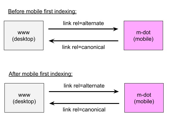
Note that Mueller explained nothing has changed with mobile-first indexing related to sites with separate mobile URLs using rel-canonical. Mueller recommends keeping the annotations the same.
Google will use the mobile URL as the canonical even if the rel-canonical points to the desktop URL. Mueller created a helpful graphic that shows a “before and after” indexing process for desktop and m-dot URLs.
Read more: Google’s John Mueller Clears Confusion About Mobile-First Index.
Core Web Vitals + Mobile First
The Page Experience Update, specifically Core Web Vitals, also needs to be part of the conversation about mobile-first indexing.
Advertisement
Continue Reading Below
There is a lot of overlap between Core Web Vitals and the mobile-first index because both look at how a page performs on a mobile device.
Keep in mind that the Page Experience Update also includes mobile-friendliness, safe browsing, HTTPS, and avoidance of intrusive interstitials.
Core Web Vitals are factors Google considers important in a user’s overall experience on the web page, including Largest Contentful Paint (LCP), First Input Delay (FID), and Cumulative Layout Shift (CLS).
Each of these factors contributes to the user experience and is scored as “Good,” “Needs Improvement,” or “Poor.”
Now, let’s see how this ties into mobile-first indexing.
Martin Splitt, who works in Google’s Developer Relations, was asked if the Page Experience Update was going to roll out on mobile and desktop pages at the same time.
His response was that it would start with mobile pages first.
It was also made clear that Google would assess mobile pages separately from desktop pages, meaning there is no aggregate score of mobile and desktop (at least not for now).
Advertisement
Continue Reading Below
Just as you need to pay attention to the desktop and mobile versions of your site for the mobile-first index, you also need to for the Page Experience Update.
Check out Core Web Vitals: A Complete Guide for detailed information about this update and how to implement fixes.
One last note before we move on: When Google scores a page, it will test the speed, stability, and usability of the page version that the user ends up seeing.
Here’s where things get tricky. For Core Web Vitals, if you have an AMP version, Google will use it for page experience scoring (i.e., speed, quality, and usability). The mobile version would not be used.
Yet, the mobile version is what would be crawled for the mobile-first index.
So, to sum it up, the AMP version would be used for Core Web Vitals scoring and the mobile version would be used for mobile-first indexing.
Read Google Mobile First Indexing and Scoring of Sites with Mobile and AMP Versions for the full explanation from Mueller.
Advertisement
Continue Reading Below
Improve Performance in Google’s Mobile-First Index
Here is a consolidated list of items to check that build on some of the best practices already provided.
1. If You Have Multiple Versions, Make Sure Important Content is Shown on All
Make sure your important content — including structured data, internal links, images, and so on — are on the mobile version of your website, too.
Google even warns in its mobile-indexing best practices that if you have less content on your mobile page than the desktop page, you will experience some traffic loss when your site is moved to mobile-first indexing,
Read more here: Google: Mobile-Friendly Does Not Mean Ready For Mobile-First Index.
2. Let Googlebot Access and Render Your Content
Google recommends that you use the same meta robots tags on the mobile site, avoid lazy-loading primary content (Googlebot can’t load content that requires user interaction), and allow Googlebot to crawl your resources.
3. Verify Structured Data
Double-check that your structured data is the same on both the desktop and mobile versions of your website and also ensure the URLs are correct.
Advertisement
Continue Reading Below
4. Improve Mobile Page Speed
Page speed has been a factor to consider for a long time and it is even more important with the mobile-first index and Page Experience Update.
Advanced Core Web Vitals: A Technical SEO Guide is packed with how-to advice on identifying and addressing speed-related factors that impact Core Web Vitals and mobile-first indexing.
5. Keep an Eye on Mobile Errors
As with most SEO work, getting a site to perform well in the mobile-first index is not a “one and done” task. You need to be closely monitoring Search Console so that you can identify and fix mobile errors.
Make it a habit to regularly view the “mobile usability” and “Core Web Vitals” reports in Search Console.
Keep Reading: Google’s Changelog on Mobile-First Indexing
The changelog in Google’s mobile-first indexing best practices gives a quick recap of the changes since 2016.
Advertisement
Continue Reading Below
As you can tell, there is a lot to know and keep in mind on mobile-first indexing.
Make sure you are staying on top of best practices and monitoring your website’s performance to succeed in the world of mobile-first indexing.
More Resources:
Image Credits
All screenshots taken by author, June 2021