Think about your social media scrolling behavior. What makes you stop and take a second look at a post?
More often than not, it’s the graphic — whether it’s a sarcastic GIF, a hilarious cat, or a smiling baby — that gets your attention.
When running Facebook ads, the best copy is likely to be overlooked if it’s accompanied by a mediocre image. Read on for 10 tips to up your creative game in Facebook advertising.
1. Customize Images by Placement
The Facebook Ads interface lets you select unique images for different placements. Ideally, you should use vertical images for the Stories format to fill the whole screen, while using horizontal or square images for the News Feed.
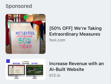
The desktop right sidebar placement is also one to be conscientious of, particularly since Facebook changed its layout in late 2020. Previously, only rectangular (1200 x 628) images showed up in that placement; now, Facebook, will show a square image in that space if you use one, allowing for more prominent ad space.
Advertisement
Continue Reading Below
In addition, be mindful that ads in the right sidebar will be significantly smaller, meaning that any text you include in your images will be barely legible. I would recommend minimizing or completely removing text from any images that appear in this placement.
Notice how it’s difficult to read the copy in the below ad examples. In addition, see how the ad with the square image is much more prominent:
Advertisement
Continue Reading Below
2. Use Text (Smartly)
In 2020, Facebook finally did away with the 20% text rule, no longer penalizing ad images for including text. I’d encourage you to test images with text in them, but don’t overdo it.
Often a simple benefit point will get people’s attention more than a text-overloaded image.
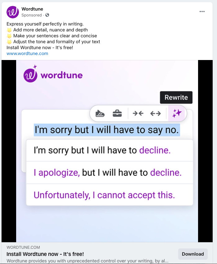
Depending on your product, there may be additional creative ways to incorporate working text into your image. For instance, the below product promises to help refine your writing style.
In this case, the text in the image highlights a use case for the product, while showing off features.
3. Think Twice About Stock Photography
We’ve all seen the generic stock photos people insert into their ads, such as the well-dressed businesspeople staring coldly into space as they sit around the conference table. While stock photos may offer an easy solution for brands without a designer or good photography, these photos often are less likely to grab attention and yield a direct association with your brand.
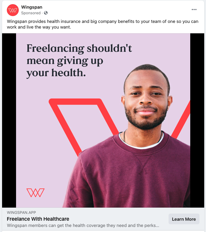
If you choose to use stock photos, think about adding some sort of branded element, such as your logo, into the ads. You can also include overlaid text specifically mentioning the offer you are promoting.
For instance, the ad below incorporates a photo of a person but also places that on a background with the Wingspan brand logo and a quote to get attention from people with the problem the company seeks to solve.
4. Include Star Ratings
If your business has a four- or five-star rating, include that in your ad imagery! Positive ratings will stand out and encourage people to take a further look.
Advertisement
Continue Reading Below
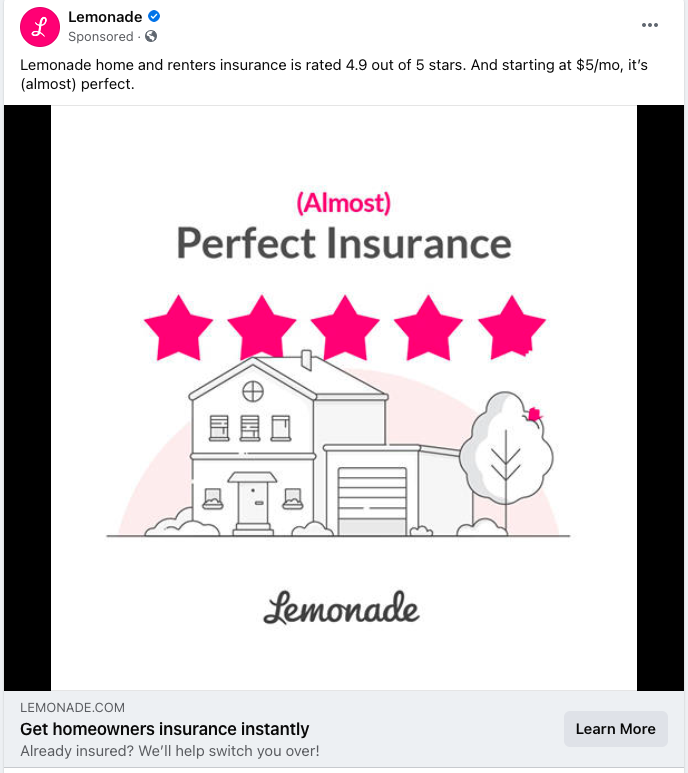
In the example below from Lemonade (a home/renter’s insurance company), note how the stars match their brand color. In addition, the ad contains an image of a house (the product they insure) along with their logo.
This creative carries both the positive rating and the direct brand association.
5. Show the Product
If you’re selling a tangible product, show it in use in your ad imagery. People will know exactly what you’re selling and how they could incorporate that into their lives.
Advertisement
Continue Reading Below
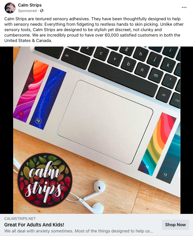
For instance, the ad below for Calm Strips immediately gets your attention as you see the colorful strips stuck to a laptop. Then, you can read the copy for more information about the purpose of the strips.
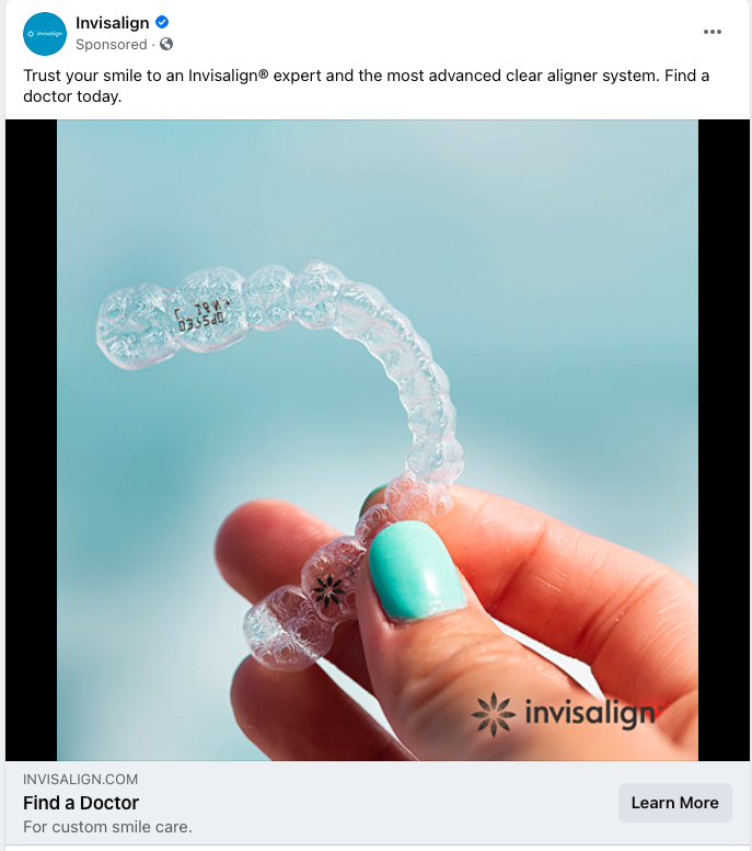
Sometimes, it might not be practical to show the product in actual use, but you can still show it by itself.
For instance, you might not even be able to see this clear aligner on someone’s teeth without looking closely, but an image of someone holding it shows how simple and unobtrusive it is.
At the end of the day, investing in decent product photography can go a long way. Even if you don’t want to pay a professional photographer, buy an SLR camera with a macro lens along with some lights to be able to take quality close-up shots of your product.
Advertisement
Continue Reading Below
6. Include Event Information
If your ad is promoting an event, one of the first questions people want to answer is when the event will take place. Including the date(s) right in your graphic will answer this question upfront.
That way if people are already booked that day they won’t bother to waste a further click, and people who know they’re free in that timeframe and are interested may take a second look.
A further test could entail including the time of day an event starts (especially for a one-off event that just takes place for an hour or two).
If your event involves notable speakers who might be recognized by the people being targeted, add their photos and names into event graphics. You could even test a carousel ad with multiple faces, names, and topics for events with multiple sessions.
You could test mentioning the venue or city where the event takes place if it’s happening in a physical location. The event promoted below is virtual; perhaps another test here could be to include “Virtual Event” in the image.
Advertisement
Continue Reading Below
Of course, it’s very possible in current times that people start with the assumption that an event is virtual.
An additional test could be to include a “Register” button graphic directly within the image. This could help initiate a call-to-action to sign up.

7. Include Customer Quotes
Including direct quotes from customers helps to establish credibility, whether they’re citing the problems that led them to seek out the product or the solutions that came. You might find these quotes from directly surveying customers, from online review sites, or from casual conversations that take place.
Advertisement
Continue Reading Below
Quotes help to establish a personal connection in the ad and resonate with people who can identify with what is said. For instance, the ad below for an app geared around helping people focus at work cites a quote many will identify with about no longer having the “ability to do deep work” with all the distractions faced in a modern world.
Of course, if you’re going to cite a problem, you also need to introduce a solution. In this case, the headline of the ad encourages people to “Regain your ability to do deep work” with a call to action to learn more about the product.

8. Mention an Offer
If you’re promoting a discount or something for free, mention that directly in your ad image to really get people’s attention. Be as specific as possible about what people will get.
Advertisement
Continue Reading Below
The word “free” always stands out. For instance, the ad below for a barbershop offers a free haircut experience for new customers. The word “FREE” is in red and a large font to get people to stop and scroll.
As an aside, the image jives well with the concept of an “MVP haircut experience,” showing the process of being lathered up with a wet towel.

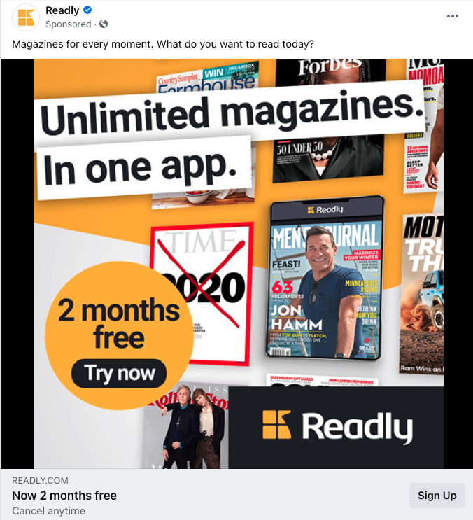
This next example promotes 2 free months of a magazine app subscription, with an added CTA to “Try Now” right in the image.
Advertisement
Continue Reading Below
The image also incorporates specific examples of magazines readers will get access to, which may help get the attention of people who particularly enjoy Forbes, Time, or other publications pictured.
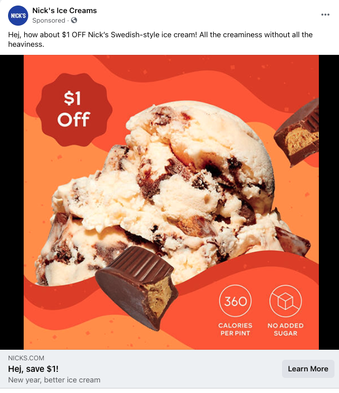
If you’re offering a specific dollar amount or percentage off your products, cite that in your images.
Coupon grabbers will immediately tune in to a chance to save, and an offer may encourage people to try a product they’ll then like and continue to purchase in the future, as with the ice cream ad below.
9. Include Specific Stats
If you have studies or surveys showing statistics that reflect positively on your brand’s success, include those in graphics.
Advertisement
Continue Reading Below
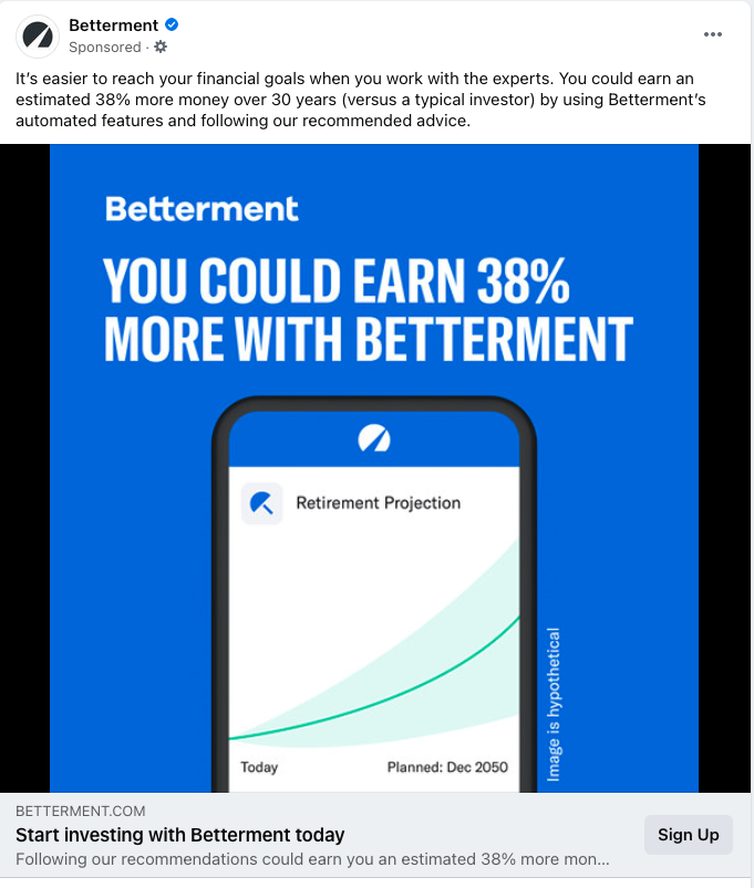
For instance, Betterment’s ad cites that people can “earn an estimated 38% more money” with them vs. using “a typical investor.”
Mentioning the percentage in the image copy, as well as including the upward graph, helps make the case that Betterment is a good choice for seeing investment growth.
If you conducted a survey of your target audience, you could cite a statistic about how a large subset of your prospects encounter the problem you’re trying to solve. For instance, perhaps 90% of CFOs wish they had better software in place for tracking expenses.
Advertisement
Continue Reading Below
10. Use Carousel Ads to Tell a Story
I’ve seen several brands try carousel ads, only to determine they don’t work. Unfortunately, a frequent approach with carousel ads is to lump together a few unrelated points together with stock photos, which only results in a disjointed ad that won’t garner the focus you need.
Use the multiple slides in a carousel ad to tell a story, making sure the slides fit together with a common theme. This tactic could include:
- Walking through a setup process step-by-step.
- Highlighting a handful of major features.
- Showing problem/solution steps (or before/after images if applicable).
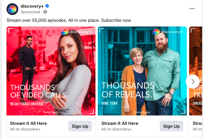
In the example below from the Discovery+ streaming service, they’ve chosen to design slides each fitting the theme of “Thousands of…” messaging, while also highlighting different shows people can watch on the platform.
Start Creating!
Hopefully, these tips inspired you to try some new creative in your Facebook campaigns! Take some time to think through designs and messaging to see what would best represent your brand.
Advertisement
Continue Reading Below
And remember, what tactics work well for one company on Facebook might not work for another (and vice versa).
Be sure to test and see what yields the best results for you.
 seolounge