Most contact pages are designed with function in mind.
They slap an email address, phone, and location on a plain background and call it a day.
But basic contact pages don’t inspire visitors to reach out and connect.
Other pages make it easy to contact the company – which is awesome.
Except, that can also drive up customer service costs.
So what makes the perfect Contact Us page?
An awesome Contact Us page finds just the right balance between making it easy to reach the company and sharing resources users can use to answer their questions right away.
Keep reading to discover 39 examples of Contact Us pages that go beyond the basics and will, hopefully, inspire you to take your site to the next level.
39 Awesome Contact Us Page Examples You Need to See
1. Broker Notes
At first glance, Broker Notes‘ contact page looks pretty bare.
There’s no graphics, no quirky copy, just a plain old contact form.
Great for UX, but not so great for inspiring users to reach out.
So what stands out on this page?
The drop-down menu under “How can we help you?” lets users share the reason they are contacting the site.
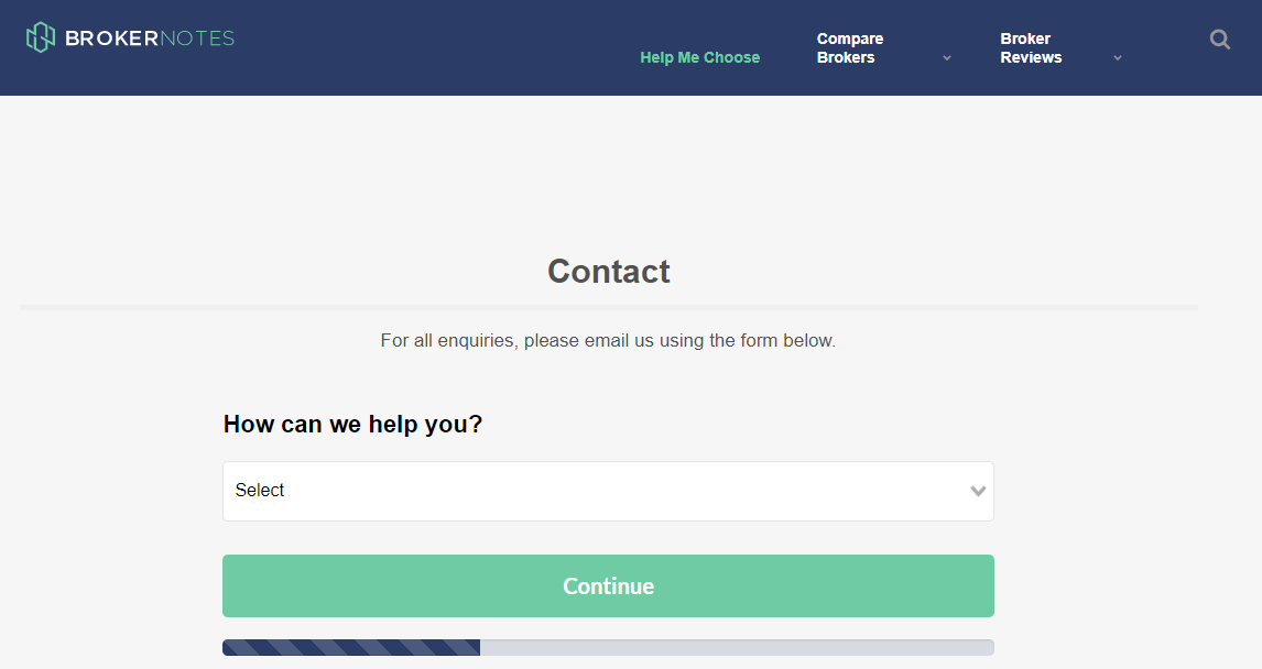
This makes it easier to sort through requests and respond to important contacts as soon as possible.
For example, if you select “I am a broker looking to advertise on Broker Notes,” it takes you to another form to share more information about your firm.
The little bar at the bottom lets you know how much time is left in the form, so users are less likely to get annoyed.
2. Sleeknote
Sleeknote uses a similar format to Broker Notes – they ask how they can help and provide links to book a demo or become a partner.
If the user needs something else, they are invited to fill out the contact form.
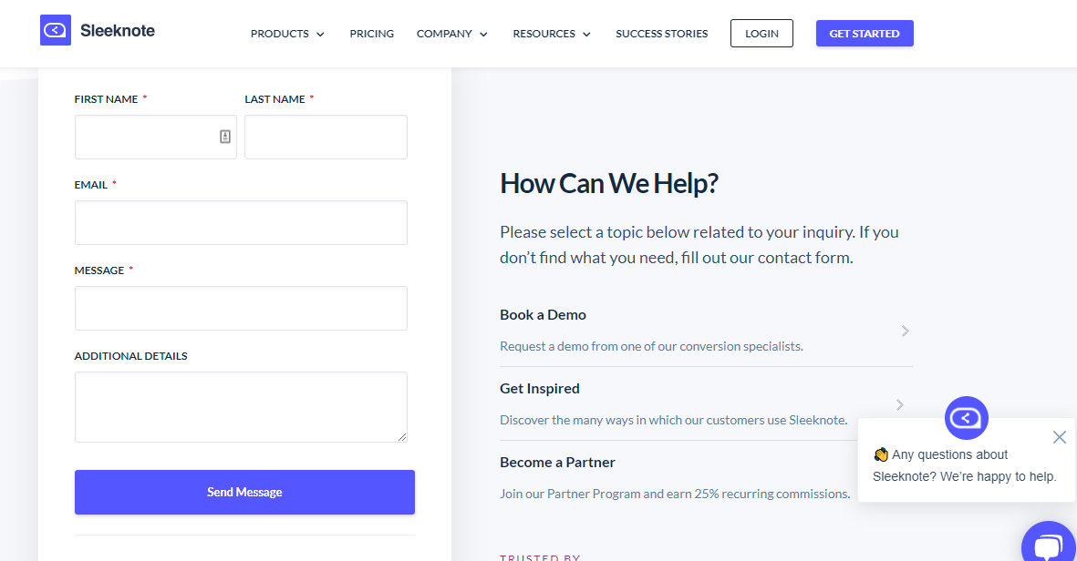
Another feature that stands out is Sleeknote’s live chat option, where users can reach out to learn more about what they offer or ask questions.
Making it easy to find information serves two purposes. It:
- Helps the customer find what they need.
- Reduces the number of contacts the brand has to manage.
In other words, it’s a win-win.
3. Yeti
Yeti‘s contact us page stands out for several reasons.
First, they offer a beautiful (and on-brand) photo background. It is striking without drawing away from the copy.
The copy is a bit cheeky, “While we’re good with smoke signals, there are simpler ways for us to get in touch.”

Below the fold, Yeti offers a range of resources, including product FAQs, info on warranties, and links to check gift card balances.
But they also don’t bury the contact info, which would just frustrate users.
Clicking on the “Send us an email” button takes you right to the contact form.
It’s easy to find but not too easy to find. (Which also helps keep away those pesky bots.)
4. BrightLocal
BrightLocal keeps their contact page simple but personalizes it with the names and faces of their support team.
This helps users feel like they are connecting with real people, not just a faceless brand.
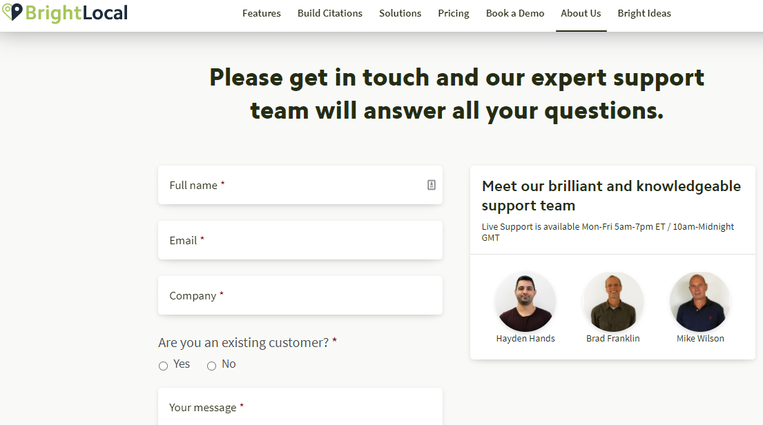
They also ask if users are a current customer, which lets them provide better service by understanding whether a contact is likely to have a question or need service.
5. RedBull
There’s a lot to love about RedBull‘s website, but their contact page really stands out.
Like Yeti, they use a striking image in the background.
They also provide a category drop-down so users can share what they need help with.
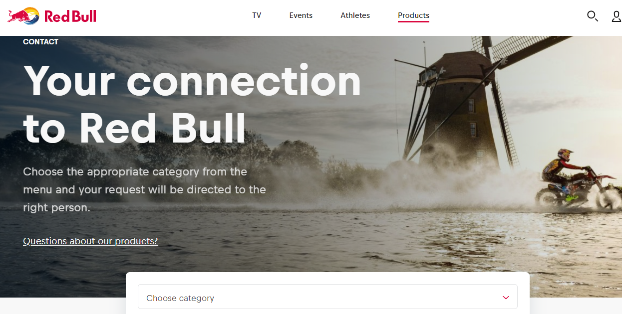
Just below the standard contact form, they provide a special form just for Press members, which is a nice touch (and likely cuts down on the number of press requests they get through their regular contact form!)
6. Chipotle
Chipotle‘s contact page starts off strong with a casual tone that fits with their corporate branding: “You’ve got questions, we’ve got answers on anything Chipotle.”
The page then offers an expansive list of FAQs (which, again, helps keep those contacts to a minimum).
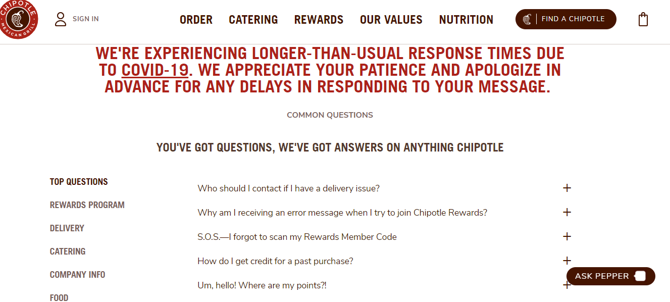
There are two things I really love about this page.
First, they get all up in your face to let you know that response times are longer than normal.
Yay for setting expectations.
But they also have a chatbot that helps people navigate the FAQs.
Chipotle strikes the perfect balance between limiting the number of emails and still providing great customer service.
7. MeUndies
If fun undies are your jam, then you’ll want to check out MeUndies.
The brand offers a fun vibe, and it shows on their contact us page.
Like most other brands, they try to steer users to their help center first.
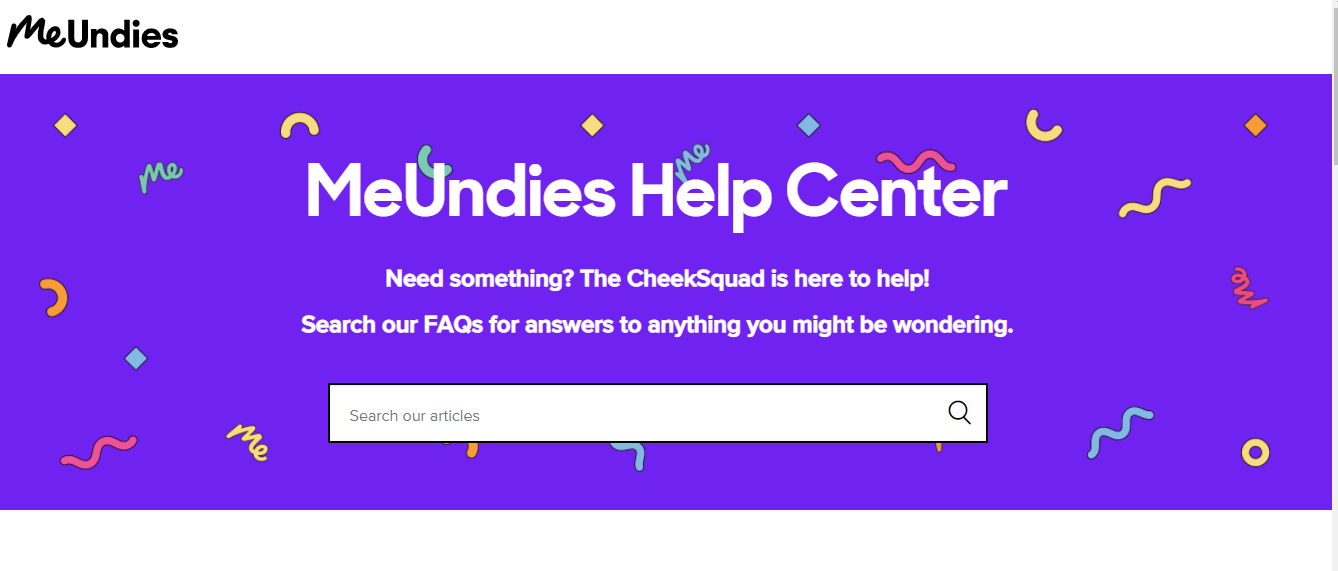
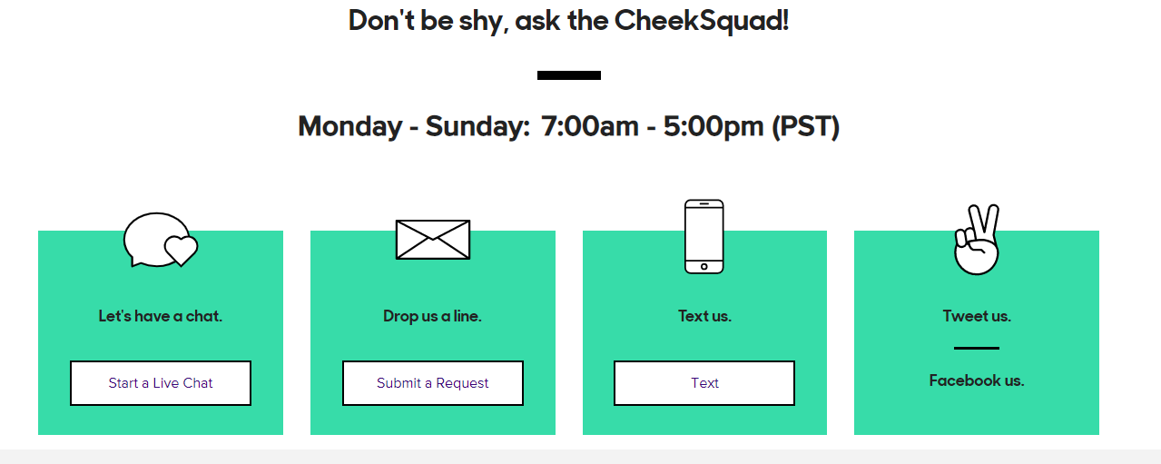
Can’t find what you need?
They make it easy to reach out to their “CheekSquad” by chat, email, text, or social.
8. Podia
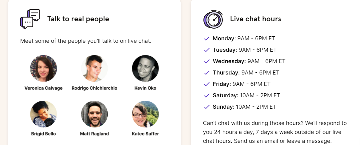
How many times have you reached out to customer support and spent days waiting for a response?
Podia starts out by highlighting their short wait time, which is really smart – especially as many people are working remotely these days.

They also share live chat hours and pictures of their support team to remind customers they’ll be talking to a real live person.
9. The Middle Finger Project
If you are looking for a book about getting unstuck and ridding yourself of imposter syndrome, I can’t recommend this book enough.
But, we’re here to talk about contact pages.
So, here’s The Middle Finger Project’s contact page:
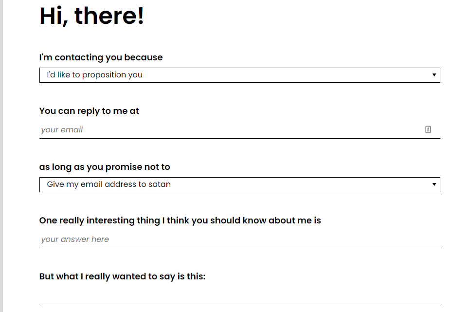
Form-wise, it’s not super exciting, right?
But I love the cheeky language and “What I really want to say is…” and the send button:

I’m not sure what the average speed of a pack of wolves is, but it sounds good.
Who said contact pages had to be boring, anyway?
10. Brands to life
Brands to life is an Australian-based branding and creative agency that helps, well, bring brands to life.
They have a unique brand that is simple and straightforward.
Their contact page includes all the standard information — name, location, email, and so forth.
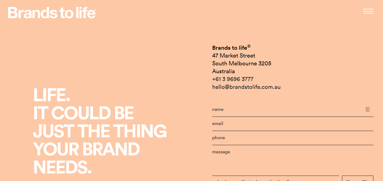
The page feels plain, but it fits with the rest of their site and their overall branding, which lets the user know who the brand is and what they can expect.
This just goes to show that contact pages don’t have to be fancy – especially if your brand’s personality is simple.
11. Kick Point
Kick Point does a great job of weeding out people they don’t want to work with right from the start – “Don’t address your email to us “Dear Sirs.” is a pretty strong statement to have top and center on your contact form!
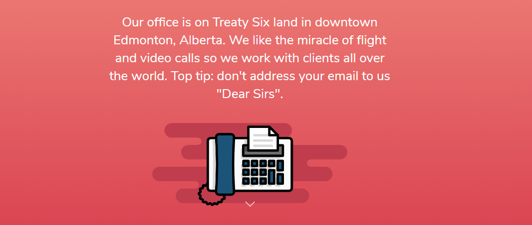
A bit further down the contact page, the team shares how long they take to respond.
It’s all relatable and on-brand.
I dig it.
12. Leeds Golf Centre
What does a golf course have to teach us about creating an awesome contact page?
First, they make it easy to book online, which is likely the main reason folks head to their website.
Smart.
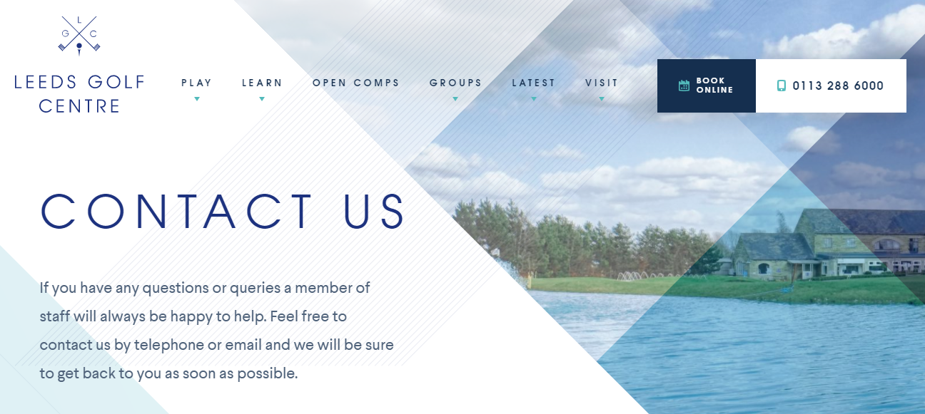
A bit further down they list all their contact info – phone, email, even fax.
But what really stands out is their contact form, which features a nifty little checkbox for folks to sign up for their newsletter.
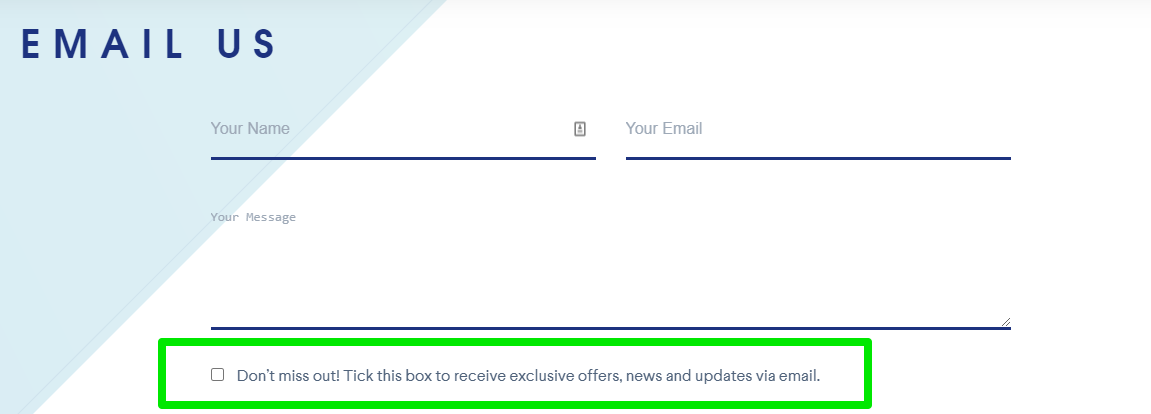
Users have to check the box – they aren’t being sneaky – but it’s an easy way to increase newsletter sign-ups.
13. Nebular
Nebular is a U.S.-based digital development agency.
Their website is bold and loud, and their contact page sticks to that theme.
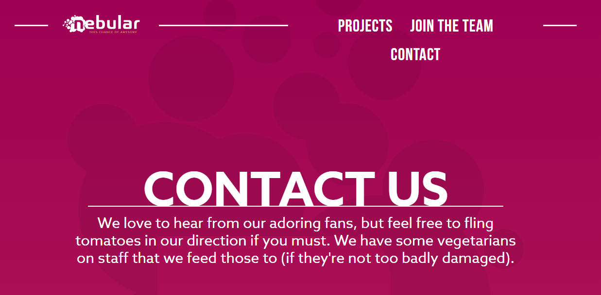
The self-deprecating humor shows off who they are as a business in just a few lines and the bold colors are carried over from the rest of the site.
Simple, but effective.
14. Basecamp
Who is on the other end of that contact form?
With some companies, you’ll never know.
Basecamp, however, shows off their teams smiling (though drawn) faces right at the top of the contact form.
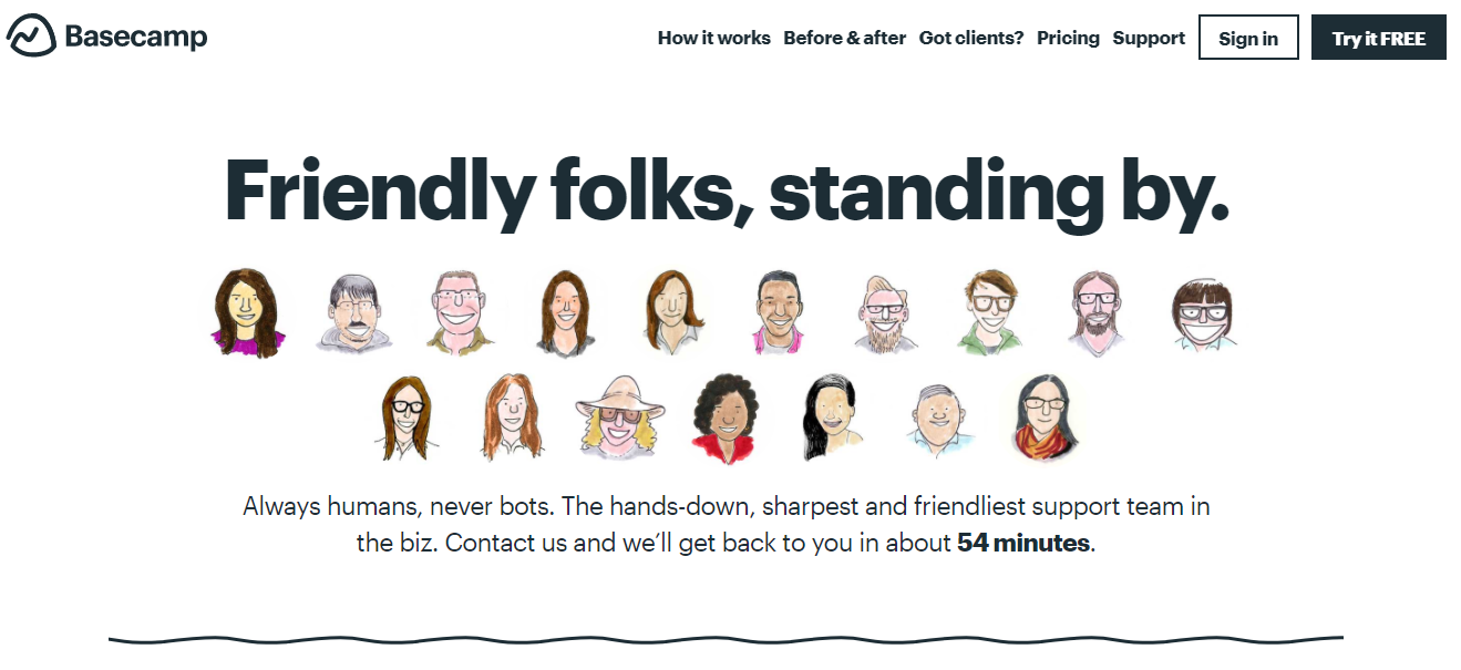
They also include links to sign up, learn more about their offerings, and pricing.
As a result, their contact page feels welcoming and easy to use.
15. ConvertKit
ConvertKit is known for its automated email service tools designed to help customers get the most out of their marketing.
Their contact page highlights one of their main goals – customer success.
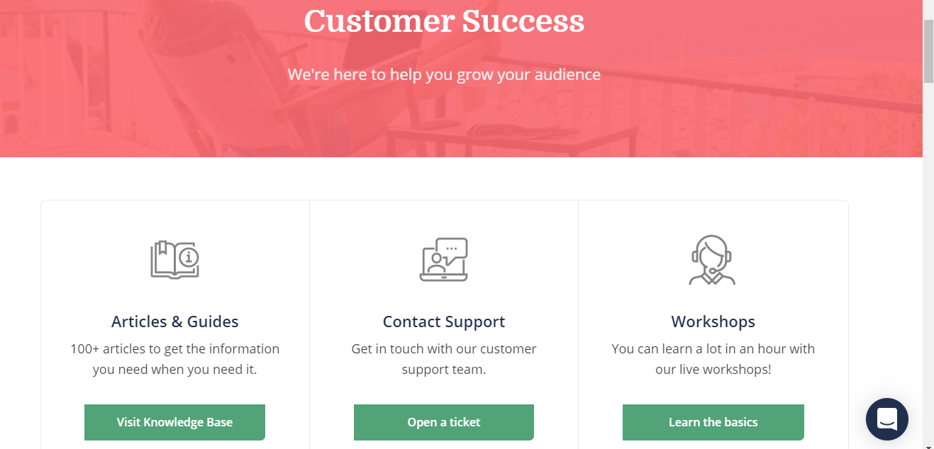
Just below the hero image, customers can click to visit the knowledge base, reach out to support, or learn the basics in their workshops.
And, like many other brands, they offer live chat right on the contact page which can help reduce customer frustration by helping them find the info they need right away.
16. Moon Pie
Moon Pie has one of my favorite brand Twitter accounts (seriously, check it out), so I was going to go check out their contact page for this list.
Sadly, there was none of the tongue in cheek charm to be found on their contact page, but it is incredibly well laid out.
For starters, they offer easy links to call or contact each of the brand’s locations — and show where to place wholesale orders.
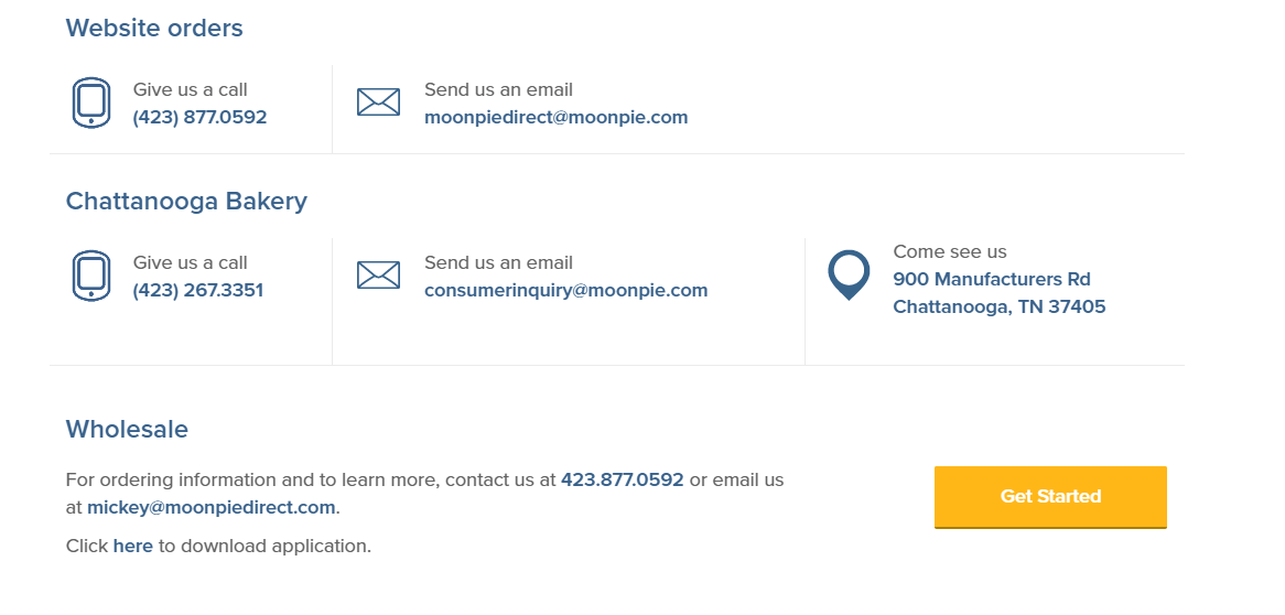
A bit further down they share FAQs such as “Where can I find MoonPies in my area.” and “Are MoonPies kosher?”
Only after sharing that information do they give you a contact form.
The contact form isn’t hidden at all – but they sure do everything they can to answer your questions before giving you the contact form.
17. Taco Bell
Here’s another brand known for its snarky social presence.
Like MoonPies, Taco Bell keeps it direct but casual on their contact page.
They ask for contact information and try to direct users to their FAQ pages first.
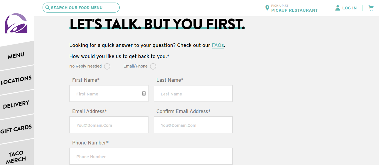
What really stands out is Taco Bell lets customers choose how to get a response – including an option for “No reply needed.”
This makes me feel like there’s a good chance they’ll actually respond to me.
18. Focus Lab
Here’s the thing – contact pages need to be functional.
If you get too crazy with the design, you might just end up frustrating users.
But, just because it has to work doesn’t mean it can’t be creative.
Focus Lab created this awesome interactive contact form that allows users to share their name, needs, and budget (which is critical for client work).
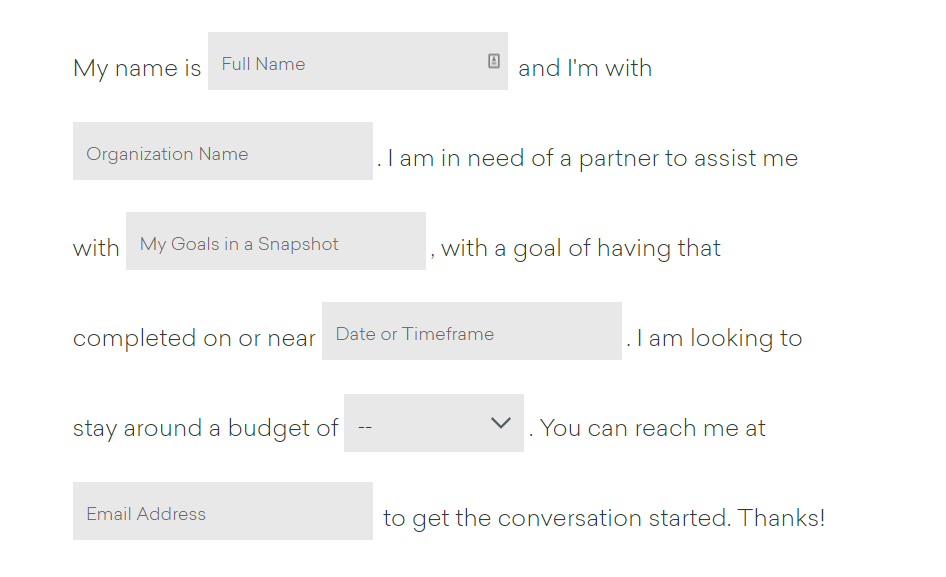
It is unique, which is part of its brand appeal.
And if the form feels like too much, you can scroll down just a bit further to find their email, location, and social accounts.
19. 99Designs
Contact pages often end up as a catch-all box – which can be time-consuming to sort through.
99Designs solves that problem by separating requests based on need with one link for help requests and a separate page for PR inquiries.
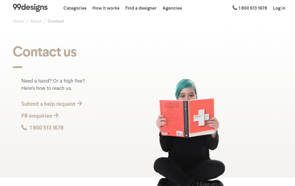
If your support times are way down, it might be worth looking for ways to segment your contact form into separate inboxes.
20. Freshbooks
Freshbooks use their contact page to drive home one of their selling points – great customer support.
They don’t offer an email support form, but rather encourage customers to call and talk to a real, live person.
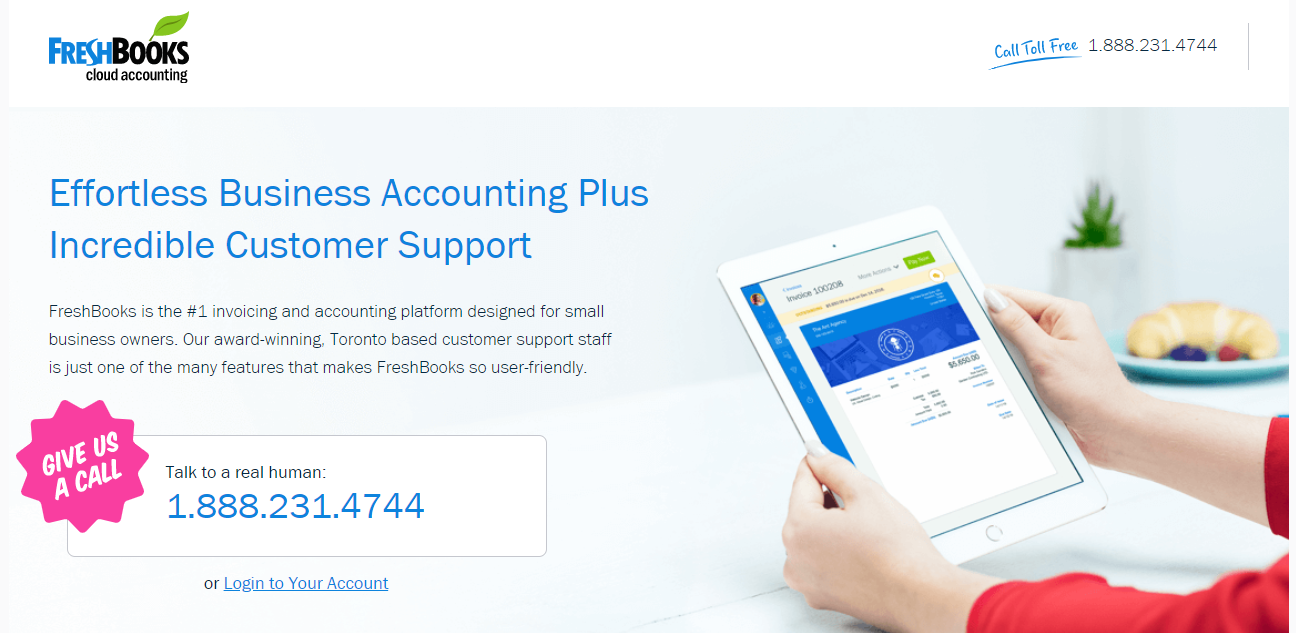
In a world of chatbots and email forms, this is pretty refreshing!
They also highlight what they offer and invite users to learn more about everything their software has to offer.
It’s almost a half landing page/half contact page. And if you expect a lot of non-customers will end up on your contact page, this is a good strategy.
22. Five
Now, I may be partial to Five’s contact us page (full disclosure: I’ve worked with them in the past), but I’m obsessed with its drop-down feature from the main navigation.

As you hover over the navigation at the top, this drop-down appears on every page of the website, making it easy for users to ask questions wherever they are on the site.
23. Xbox
My favorite piece of the Xbox contact page is the “Disability answer desk.”
I have yet to see another company add this feature to their contact us page.
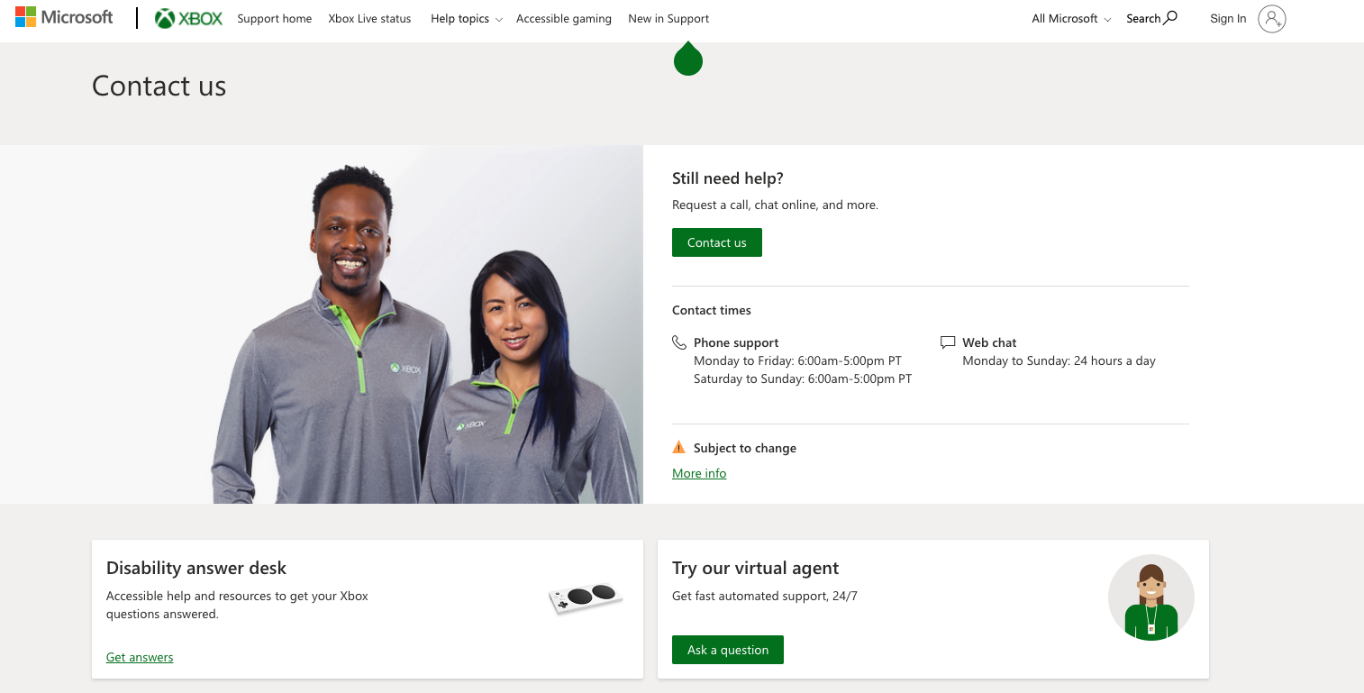
As accessibility grows in importance for SEO, I’m hoping we will start to see more brands feature these types of contact options.
Thanks for leading the charge, Xbox!
24. Zendesk
Zendesk is giving us Matrix-style vibes with their choice to choose between speaking with a sales member or browsing the help center.
Will you take the red pill or the blue pill?
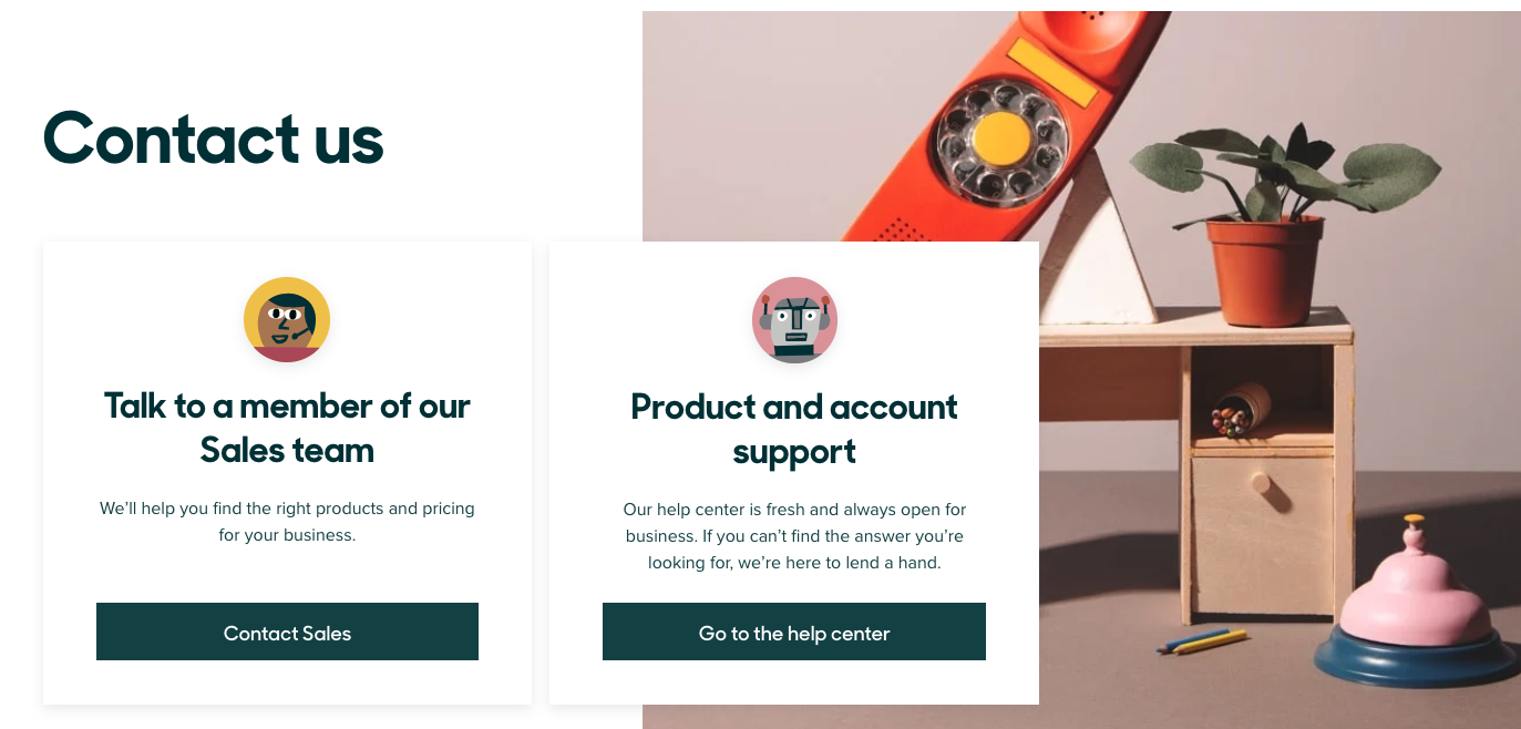
This is a common practice I’m beginning to see trending in the SaaS space.
As companies reduce overhead or work with minimum employees, they are forcing you to find the answer yourself within the help center.
But, if you want to buy, you have the opportunity to speak to a human.
25. Dollar Shave Club
While I was hoping for a unicorn or some sort of sarcasm while scanning Dollar Shave Club’s contact page, I was pleasantly surprised to find this interactive contact us page.
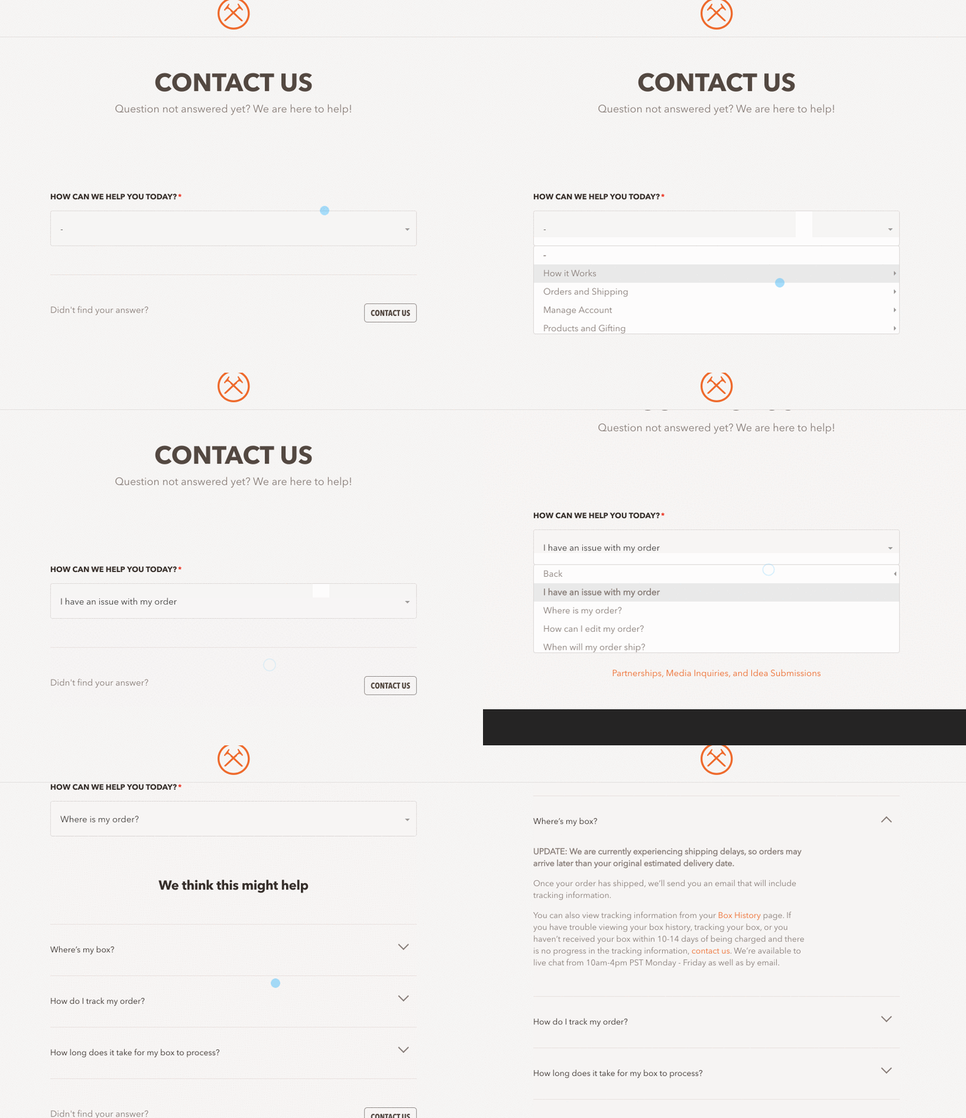
Dollar Shave Club merges the help center with their contact us page based on your query.
26. Kinsta
Kinsta, a premium WordPress hosting company, is one of my personal favorite WordPress hosting companies.
Mostly because I’ve seen page speed triple its performance after migrating to Kinsta.
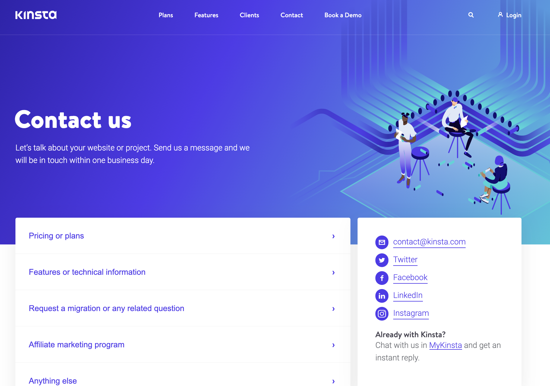
But, Kinsta’s WordPress hosting isn’t the only thing I’m in love with.
Kinsta’s contact page answers questions directly while providing a direct email address and live chat.
Full disclosure: I have provided copywriting services for Kinsta in the past.
27. Swab the World
Swab the World is becoming one of my favorite websites, mostly for its quirky copy.
You can see in Swab the World’s contact page, they convey their conversational tone even in the minimal copy on the page.
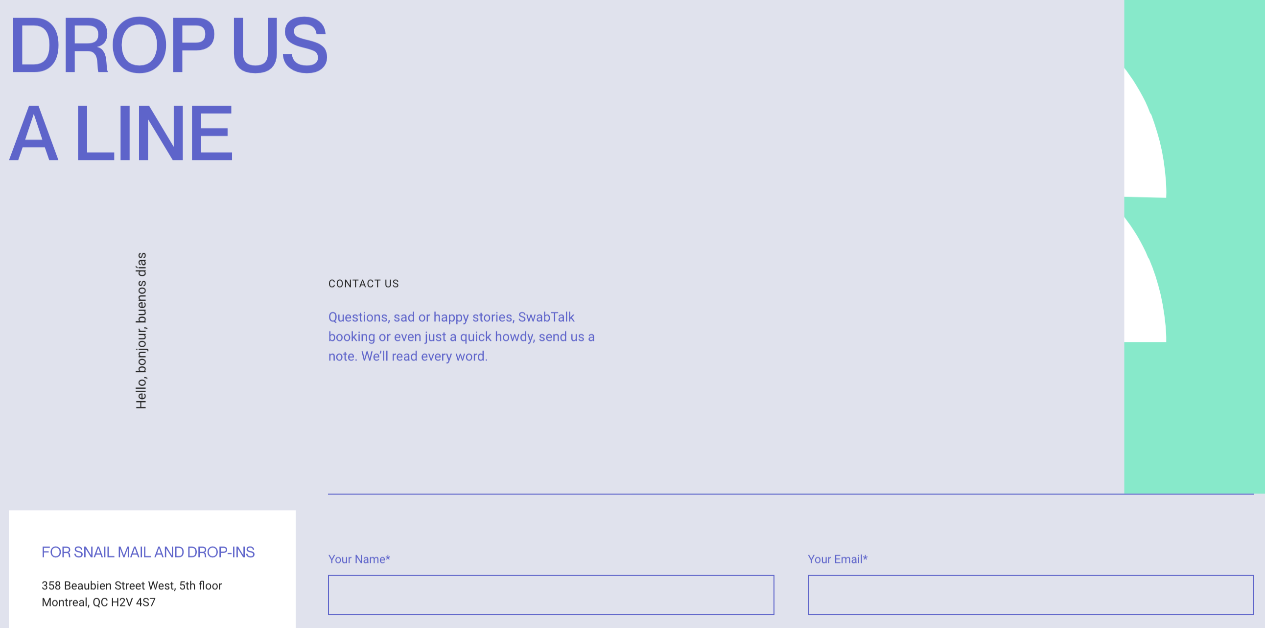
Plus, I love the shout out to snail mail. Does anyone still love getting snail mail? 🙋♀️
28. Shopify
Shopify serves up a friendly contact us page with a warm welcoming smile in the visuals.
More importantly, Shopify breaks down the sections of support you may need.
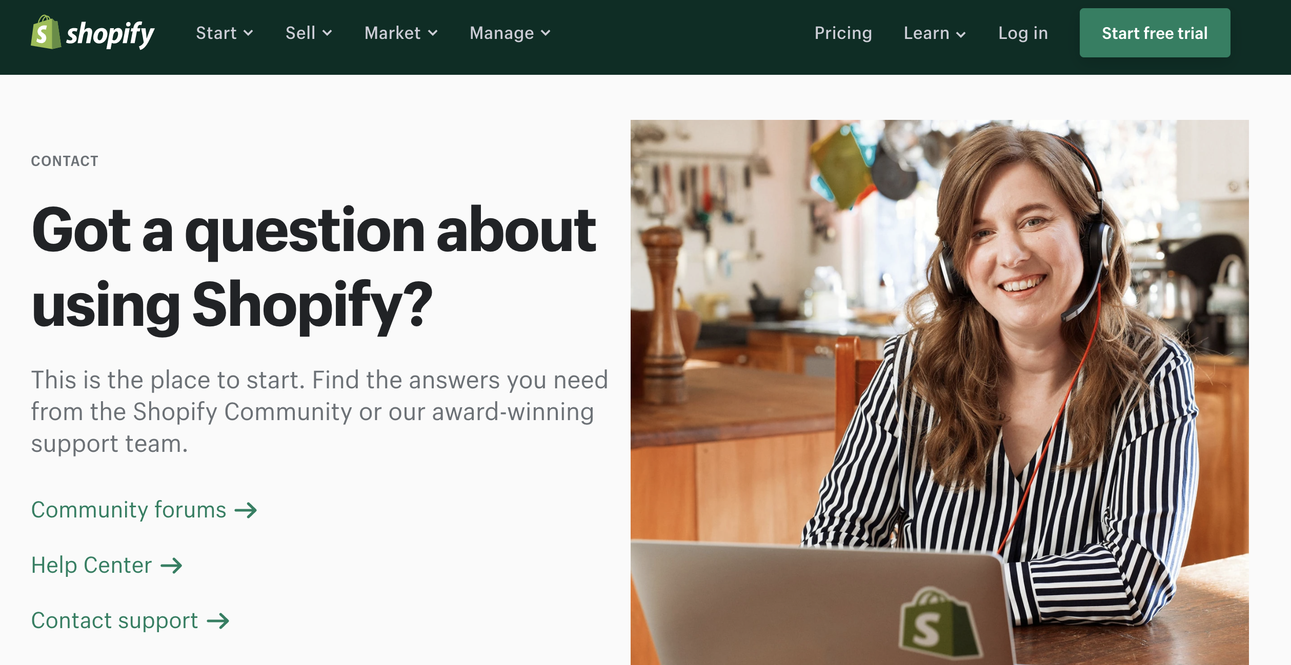
Shopify highlights its community forums, help center, and contact information for support.
Notice the arrangement?
It’s signaling to users to seek help from the forum, then the help center, until finally, you need support from a human.
29. Trello
Similar to Shopify, Trello calls out their Trello Community to help users gain support.
As more customers begin to use your services or product, it’s helpful to provide additional support from other users who may have experienced the same issue.
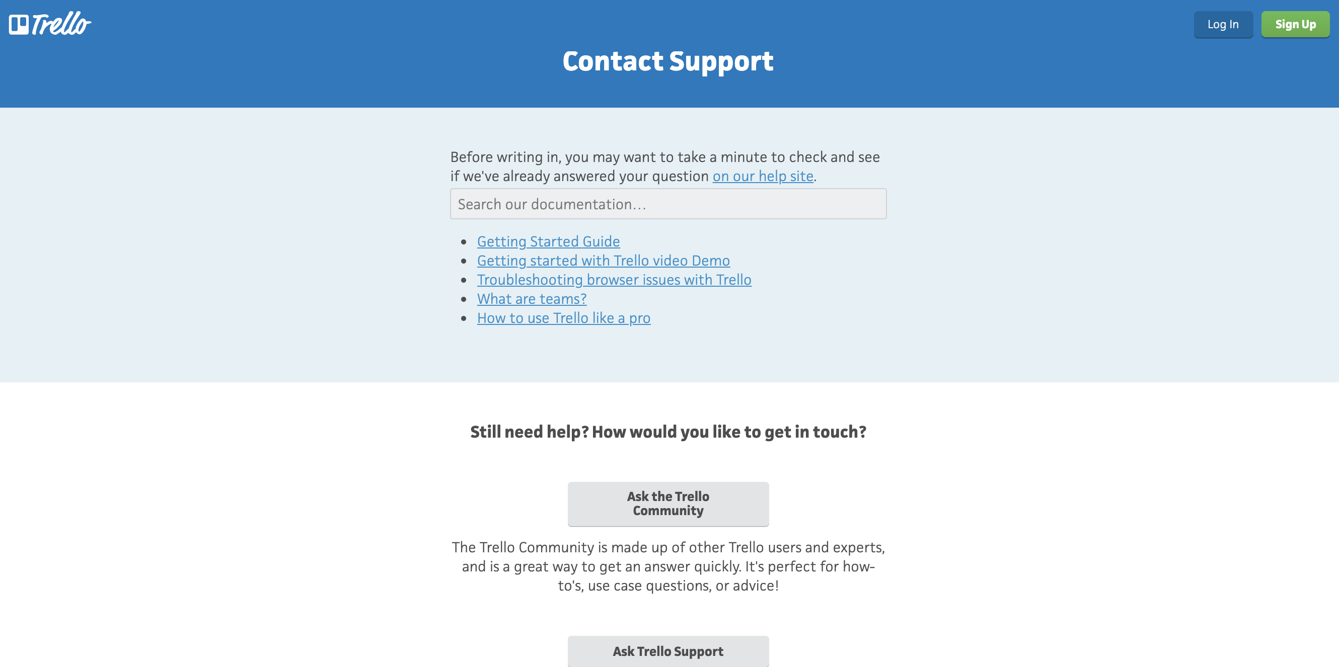
Still, when all else fails, users are able to contact Trello’s support team directly.
30. PayPal
PayPal’s customer service identifies the common queries it receives with its contact us page.
You can see below PayPal highlights issues with passwords, payments, donations, disputes, etc.
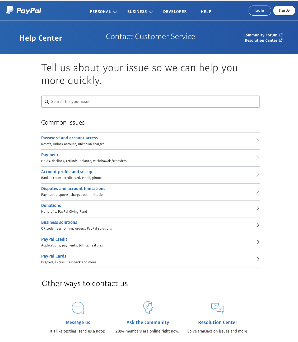
However, if you are still unable to find a solution, PayPal shares additional links to help its users find their answers quickly.
32. Ben & Jerry’s
While Ben & Jerry’s is one of my favorite ice cream brands (shout out to Phish Food lovers!), Ben & Jerry’s website design and copy have always been on the top of my list.
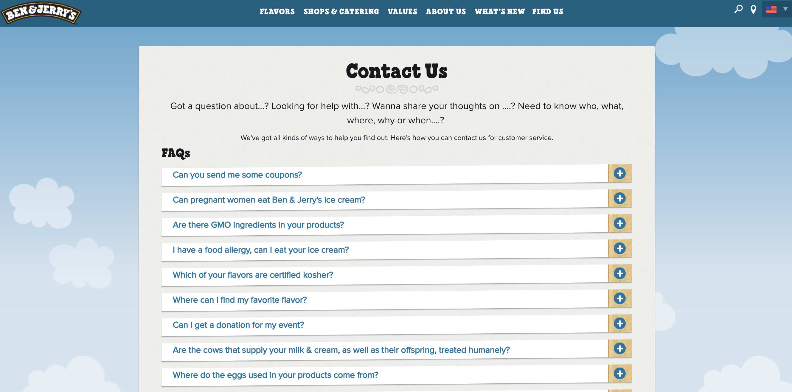
Again, similar to PayPal, Ben & Jerry’s provides an FAQ section with the most common questions asked to help speed up the response time.
33. Friends
The crew at Friends stays true to its brand with the monotone colors and playful copy.
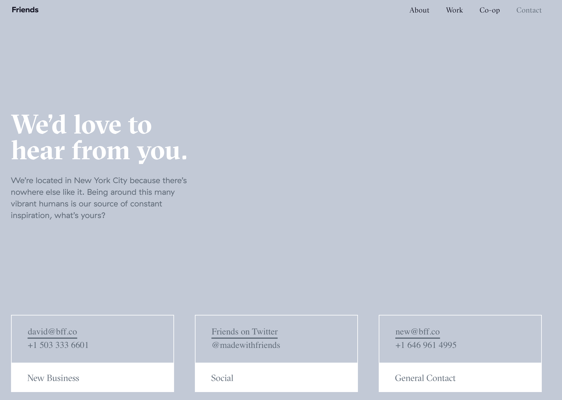
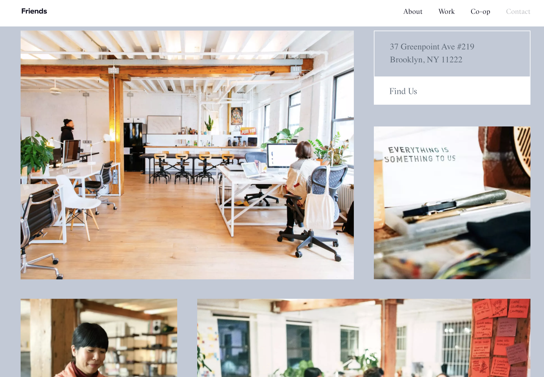
As you continue to scroll down the contact us page, Friends shares a peek inside its multiple offices to give potential clients insight into what daily life is like at Friends.
34. Bite Size Entertainment
Bite Size Entertainment took an interesting spin on its contact us page.
Instead of including a form, they use an interactive map embed to highlight restaurants, bars, and coffee shops near its office.
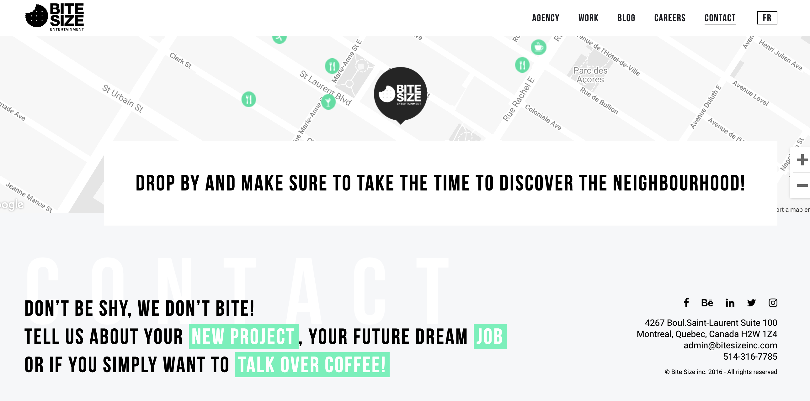 Bite Size Entertainment shows its personality by using inspiring copy like “your future dream job,” and getting personal with “talk over coffee.”
Even on its contact us page, the conversational tone is carried throughout the website.
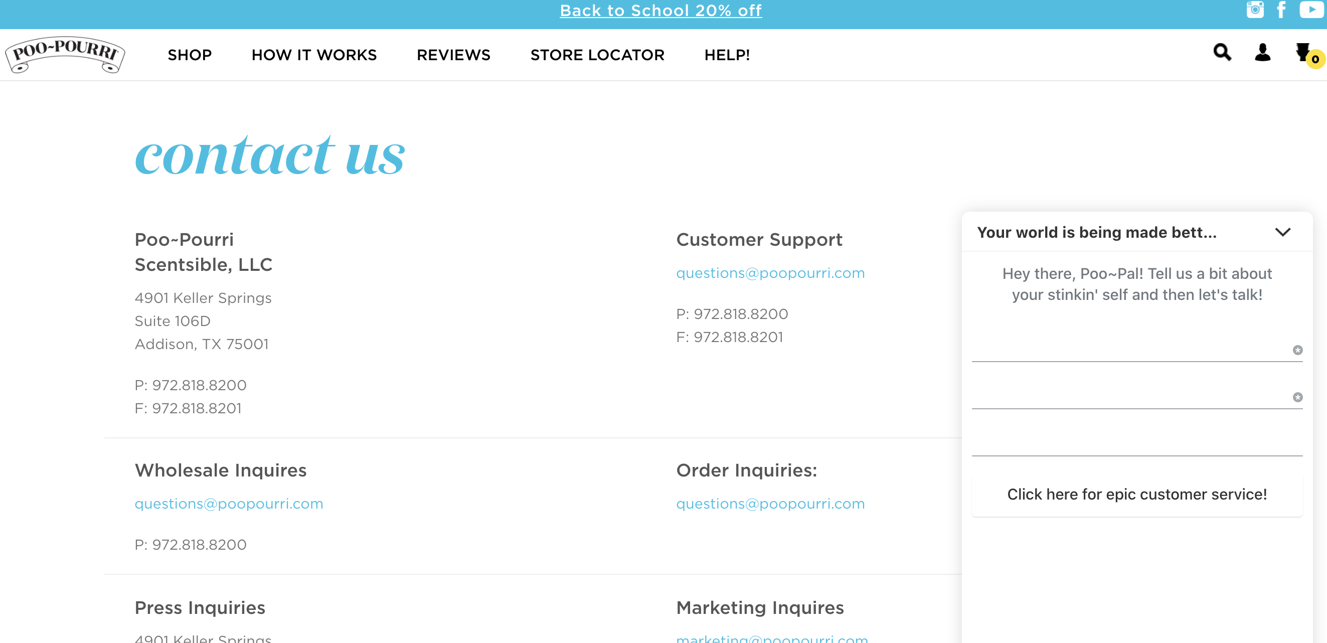
35. Poo-Pourri
After listening to a podcast with Suzy Batiz a few years back, I’ve been a big fan of the Poo-Pourri copy.
They play directly into their target audience as you can see in the live chat, “Tell us a bit about your stinkin’ self.”
36. Squatty Potty
Squatty Potty became a big deal after it’s premiere on Shark Tank and this YouTube commercial that went viral.
But, Squatty Potty’s unique sense of humor and love for 💩 isn’t the only thing I love about this brand.
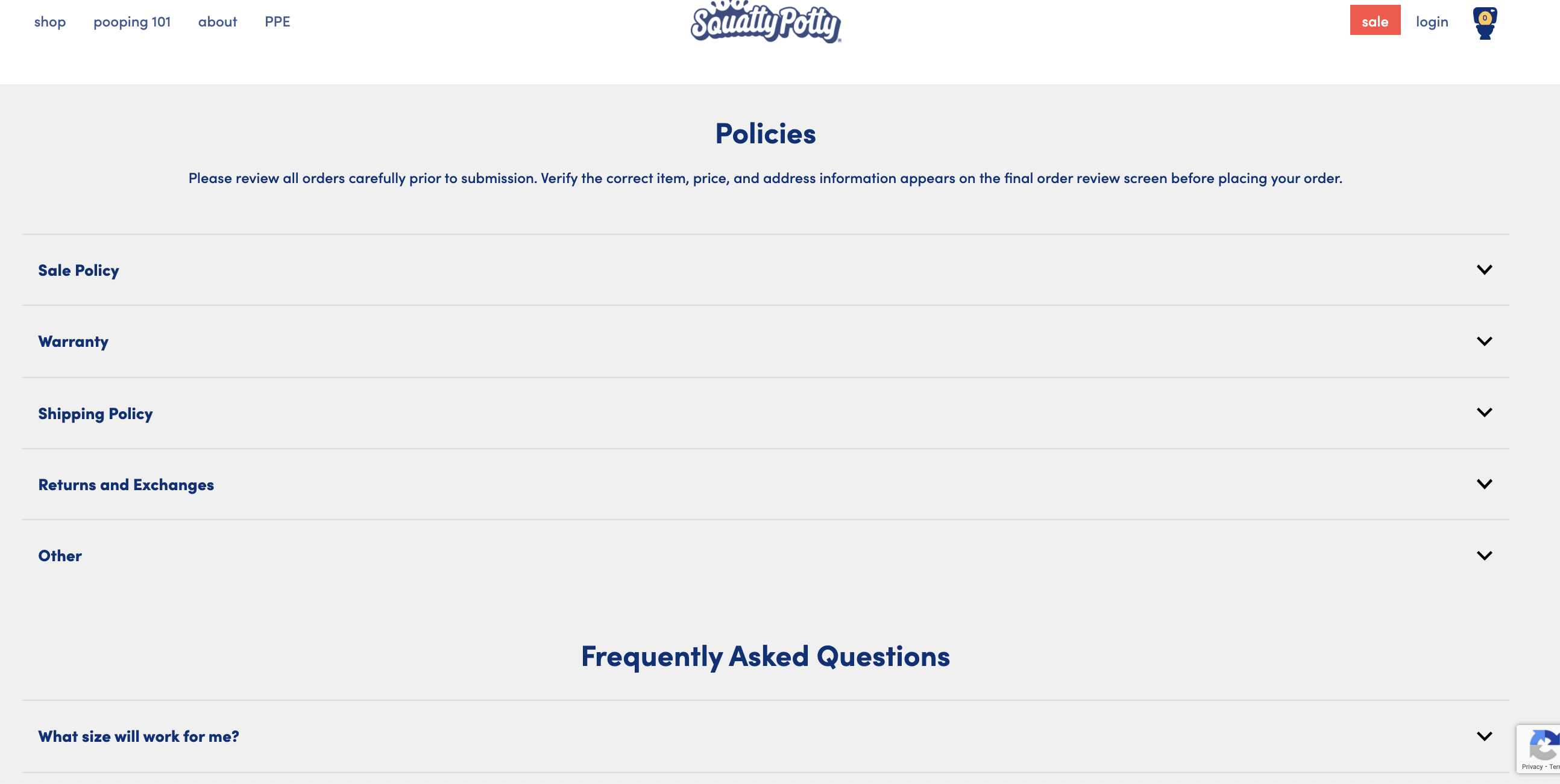
Squatty Potty’s contact us page is one you’ll want to take a peek at.

Not only does Squatty Potty provide a contact form, but they include an organized FAQ section below to help answer your questions faster.
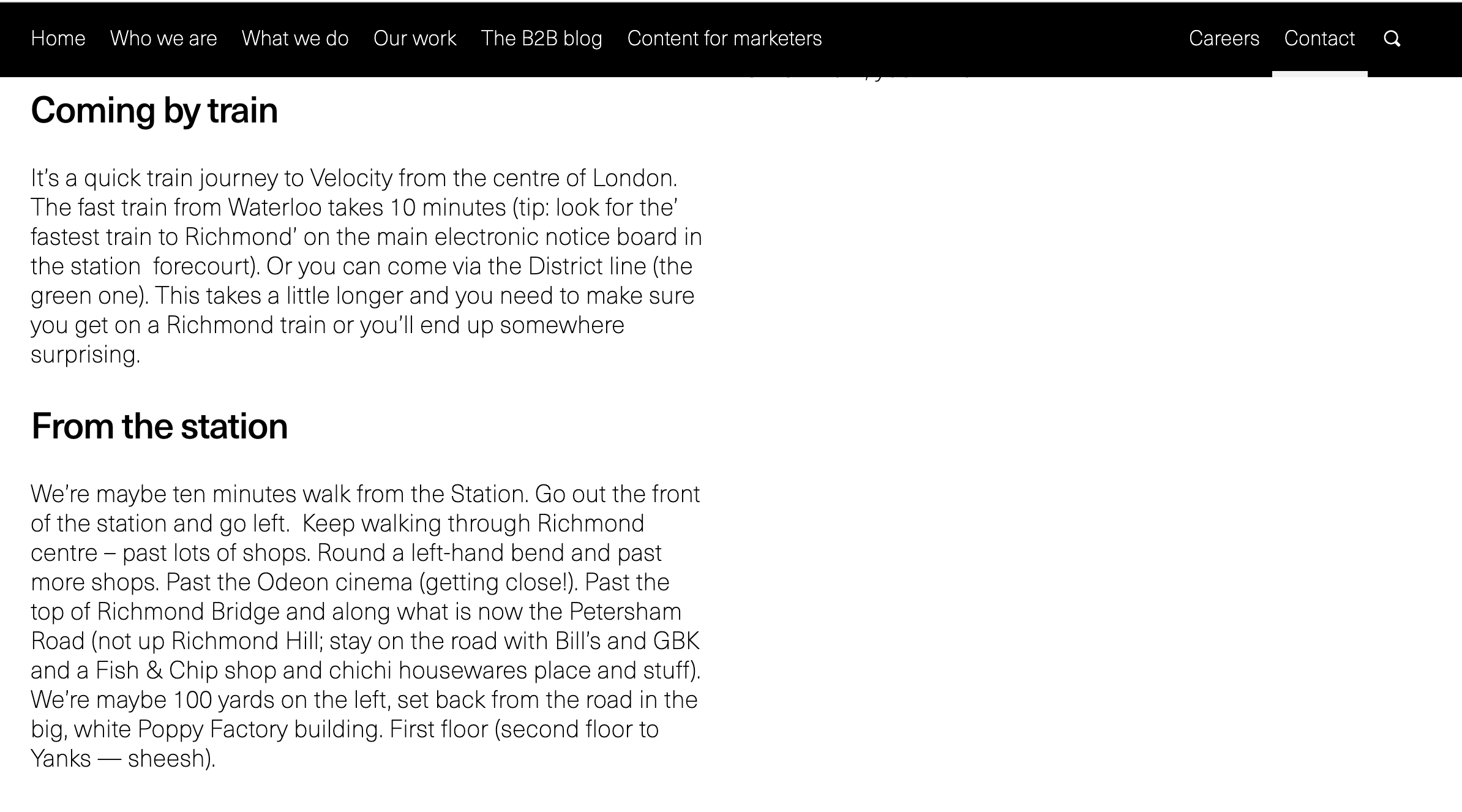
37. Velocity
Velocity is a B2B marketing agency that has been making me chuckle with its website copy for years.
It plays into its own services by acknowledging that if you land on this page, you’re in the “later stages of the B2B purchase journey.”
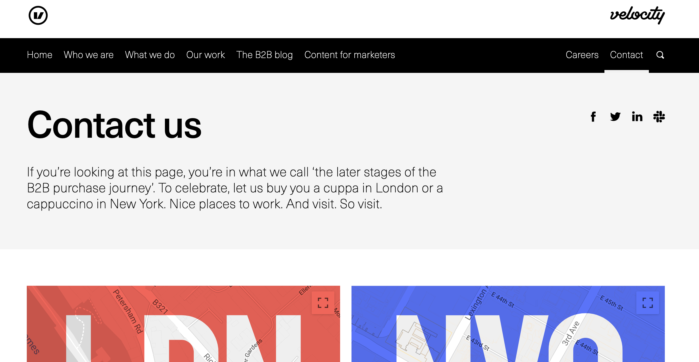
If you’re an SEO professional, you’ll love the way Velocity added directions to its offices sending tons of local signals to the SERPs by acknowledging specific train stations, cinemas, bridges, and more.
38. Ann Handley
Ann Handley has long been a fan favorite of the Search Engine Journal team.
But we’re not just fans of Ann’s storytelling.
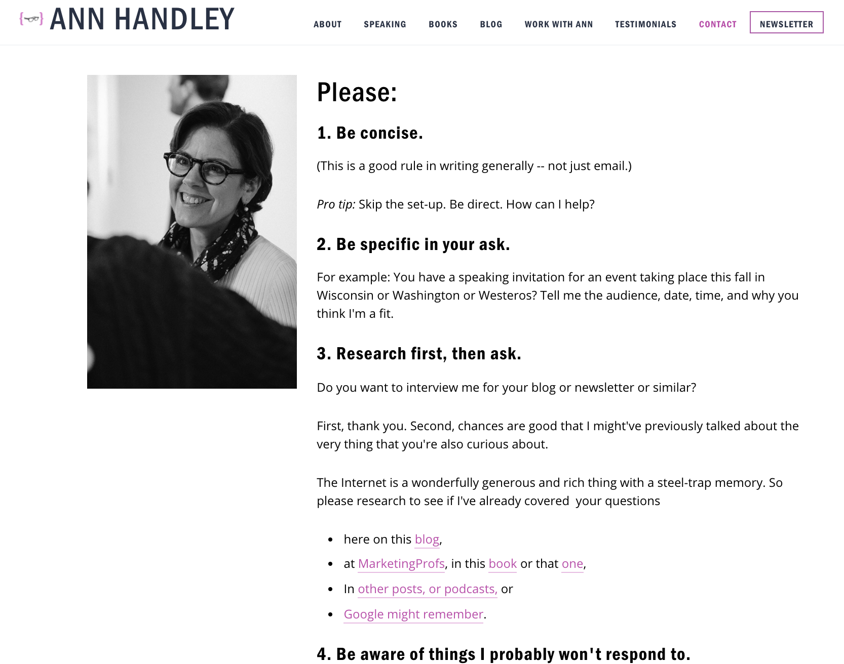
Her contact us page nails it again.
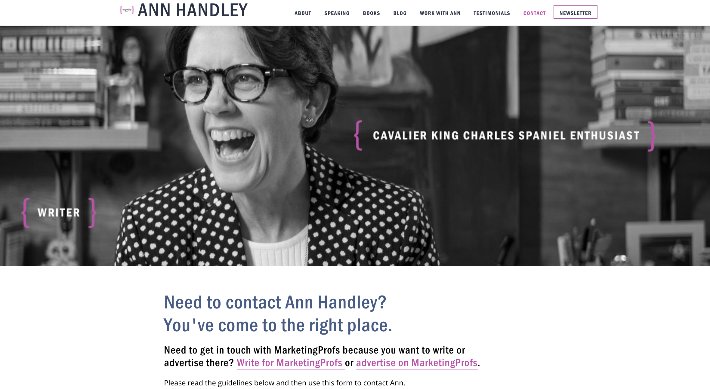
After Ann charms you with her copy above, she dives into specifics on how to email her to get a quicker response.
39. Pit Viper Sunglasses
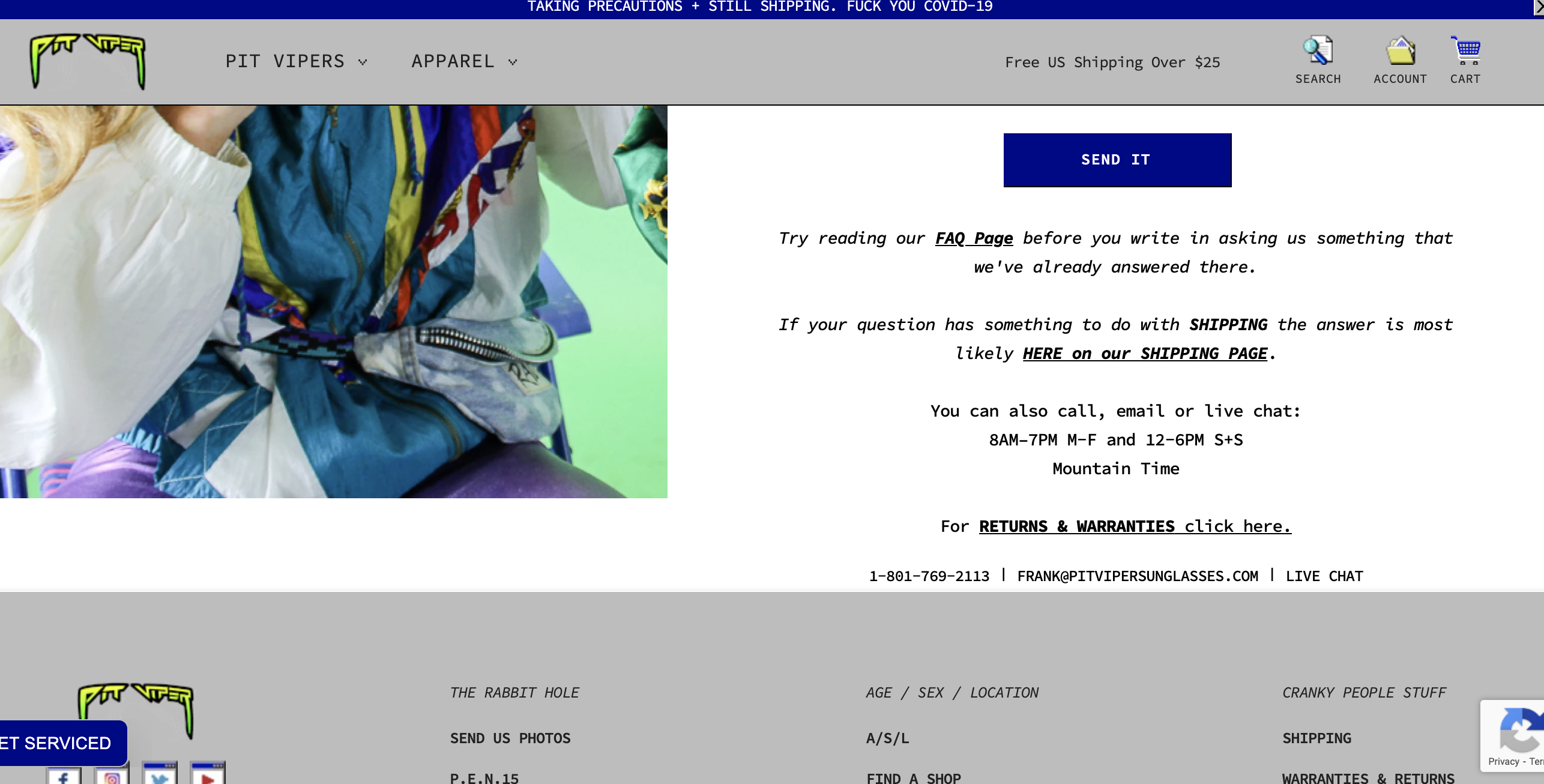
I have to admit, I bought a pair of these sunglasses based only on the website design and copy of Pit Vipers.
Between its borderline rude and snarky website copy and use of comic sans font, it’s difficult as an SEO nerd to not want to buy from this site.
Contact Us Pages Are the Tattoos of Your Site
It’s sad but true, contact us pages are the tattoos of your website.
You know they are there, but you probably forgot to take care of them and touch them up.
Contact pages need to put function first. But, as these examples show, contact pages don’t have to be boring.
Don’t be afraid to make your page fun with beautiful photos, interactive elements, and quirky copywriting that show off your brand’s personality.
More Resources:
Image Credits
Featured Image: Created by author, September 2020
All screenshots taken by author, September 2020
 seolounge