For most websites, the homepage represents your brand’s first interaction with your audience on your website.
As the catch-all landing page where people will be sent by default, your homepage needs to cater to a breadth of user needs and intent.
Consider your homepage as your shop window. It showcases your most valuable content, positions your brand so that it stands apart from the competition, and leads the user to take an initial action to enter the site and see more.
Your homepage sets the tone for your brand identity and communicates the brand messaging, company values, and personality of your business.
From your homepage, you have the first opportunity to establish positive brand recognition and clearly define the company’s value proposition to new and repeat users.
A homepage has many practical functions, too, such as:
- Making an impactful first impression.
- Driving user journeys into conversion funnels.
- Helping people discover content assets, products, and services sooner.
- Showcasing new incentives to buy and leading people to click.
- Reinforcing trust, expertise, and authority.
- Catching all topic areas that do not currently have dedicated destinations on the website.
- Resonating with your audience through your brand positioning.
Here are 25 of the best examples of homepages. I’ve looked to include a wide variation of homepage examples, so you can see practically where you can refine your own homepage for increased performance.
1. So Cosy
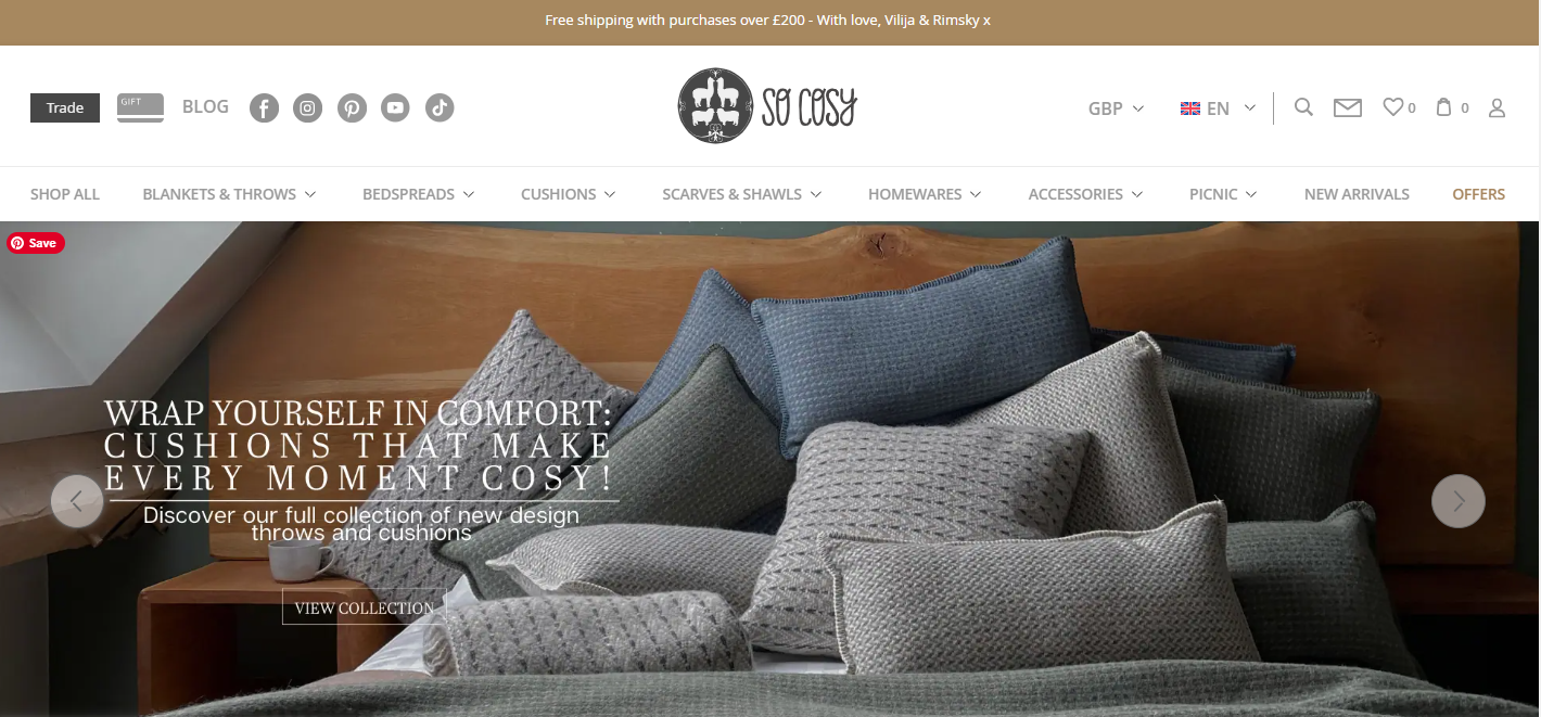
This homepage example combines setting the perfect tone through distilled messaging, imagery, and color scheme.
Everything is simplified so the user can relax, discover, and enjoy the website.
Often, so many conflicting messages are crammed into a home page that the brand and purpose of the site become lost in the noise.
This example is the perfect reminder that, in many cases, simplicity pays off for the user and for search.
 Screenshot from socosy.co.uk, November 2024
2. Toby Carvery
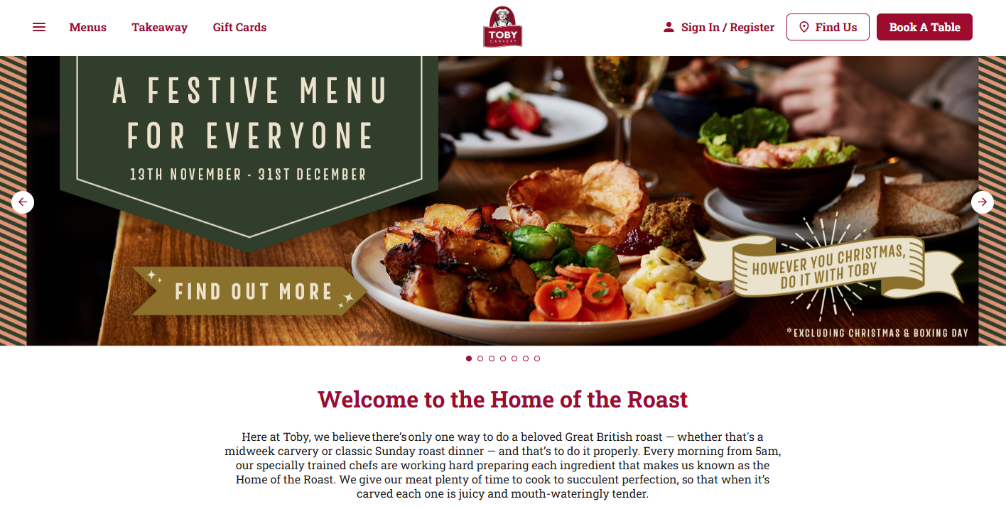
Homepages should reflect changes in your audience’s interest areas, industry trends, and broader seasonality.
This enables tailored messaging and ongoing servicing of intent to the full. This requirement becomes even greater in certain industries such as food, travel, and hospitality.
Your homepage sets the scene, showing what resonates with your key audience types, and should be proactively updated based on changing data sets.
All of this is reflected in this homepage example.
 Screenshot from tobycarvery.co.uk, November 2024
3. Safetec
Certain industries, from financial services to safety supply companies, have a stigma and preconception attached to them as needing to be positioned in extremely formal ways. It can become an easy trap to fall into, assuming people expect a certain tone and positioning.
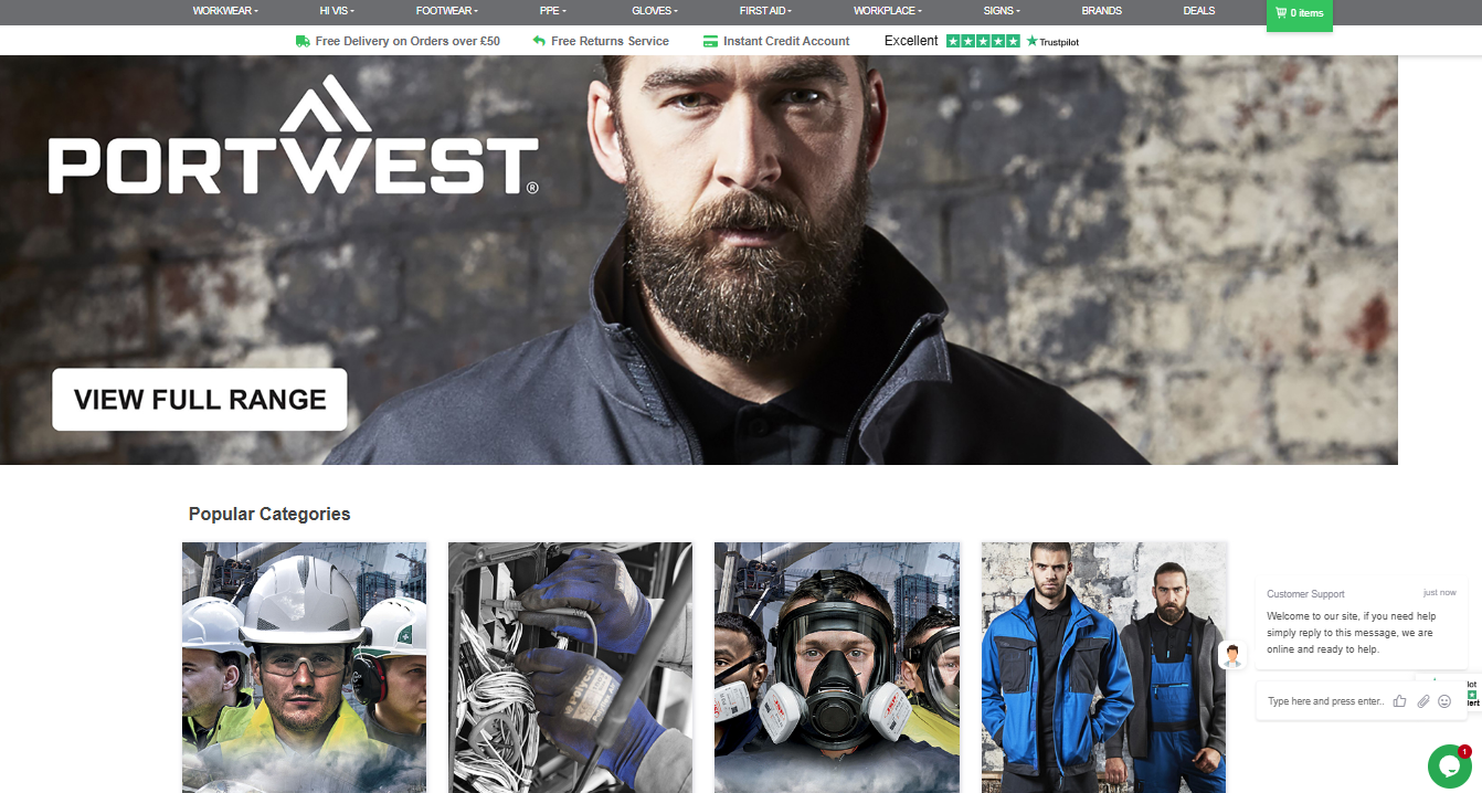
In this homepage example, the tone is relaxed, friendly, and welcoming.
Tonality includes statements like “it’s ok” when accepting cookies, and “we are here” to encourage chatbot interaction.
This subtle messaging, combined with audience-aware images and related content positioning, is a fantastic way to see how your homepage can set the tone and reinforce brand positioning from the outset.
 Screenshot from safetecdirect.co.uk, November 2024
4. Post Office
In some cases, the homepage can be the fastest way for people to achieve their search goals.
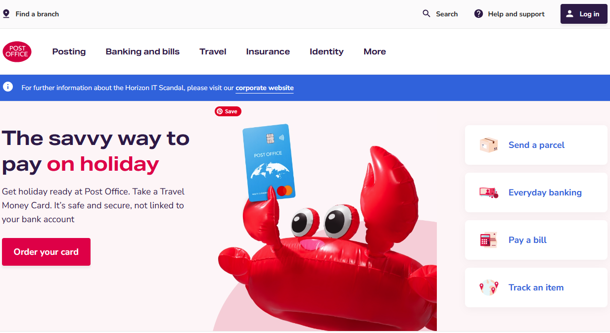
In this example, the homepage facilitates the four core functions that the users of the website look to complete most frequently without the need to go through additional pages/clicks.
Widgets on the homepage service immediate action completion in a fast, fun, and intuitive way.
While the task of paying a bill, sending a parcel, or tracking postage may not seem a fun task, this website presents a light tone and an easy way to complete your intended actions as quickly as possible, so you can get back to your other activities.
 Screenshot from postoffice.co.uk, November 2024
5. TED
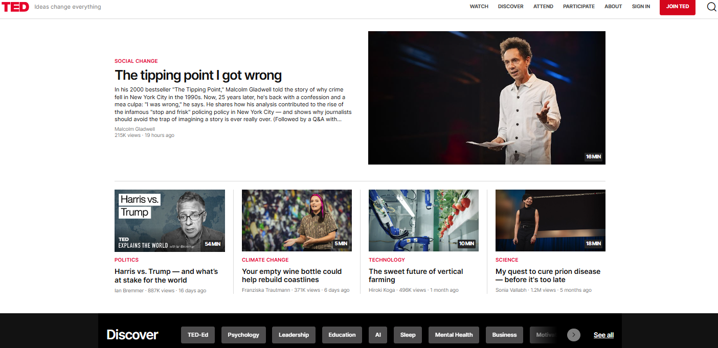
The TED homepage embodies the company’s mission of sharing information, ideas, and interests in an easy-to-digest, accessible fashion.
Content is themed into playlists, the latest, creative ideas, and other taxonomies such as “small world.”
The website taxonomy supports fast access to information topics and facilitates an easy and intuitive approach to information architecture at scale.
 Screenshot from ted.com, November 2024
6. Pandora
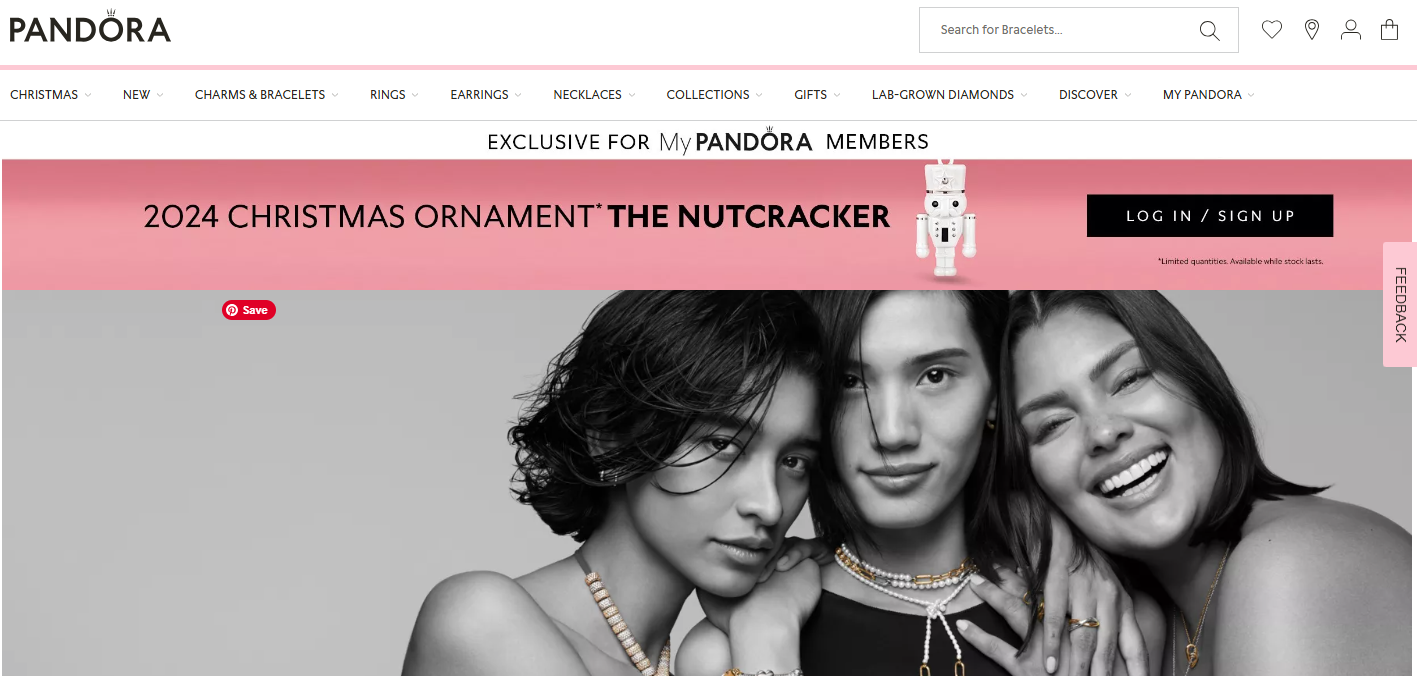
When it comes to associating the brand with the audience, Pandora does a fantastic job.
There is instant clarity, alignment of messaging, and impact of images that enable fast user engagement and establish trust and brand awareness.
 Screenshot from uk.pandora.net/en/, November 2024
7. Davy Wine
An important aspect of homepage success comes down to the use of evidence (data) to drive decision-making.
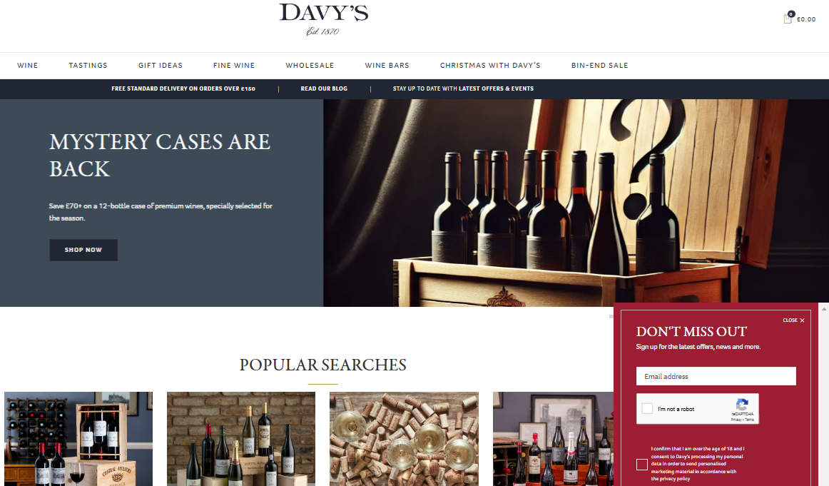
The ordering of information displayed for the home page, content segmentation, and CTAs are arguably more important than any other page on your website.
For ecommerce sites, this necessity is becoming increasingly important.
This homepage example showcases the application in data to drive optimized user journeys from the moment they land on the homepage.
 Screenshot from davywine.co.uk, November 2024
8. Under Armour
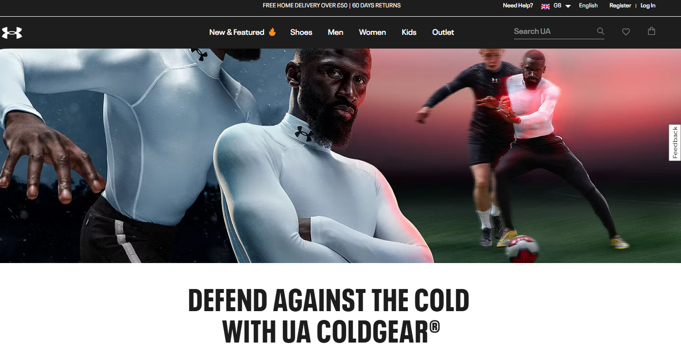
This entry into the top 25 homepage examples warrants its place, based upon well-planned information architecture and scannable content, which gives users an enjoyable experience.
Function and “fit for purpose” are understated homepage virtues that this site brings to the fore.
There is also the seasonal aspect of tapping into changing needs, wants, and pain points effectively.
The “Spotlight” segment also works well for presenting new/fresh information to returning users to expand the type of purchases being made.
 Screenshot from underarmour.co.uk/en-gb/, November 2024
9. BMW
Many car sales and dealership websites have similar approaches to homepages.
The dominant key model image is supported by quick filtering options to drive users to convert.
The stand-out item from this BMW homepage example, however, is the simplicity of messaging combined with minimal conflicting CTAs for the user.
There is no excessive sales content, and the homepage enables natural next steps rather than the excessive pushing of deals and related commercial CTAs often seen in this space.
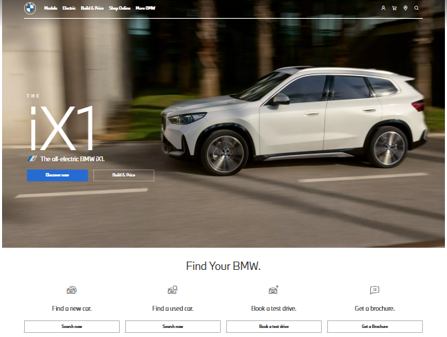 Screenshot from bmw.co.uk, November 2024
10. UCFB
This website also appeared in the best examples of FAQ pages.
The key feature of this homepage offering is that by pre-scroll, the user has full access to everything they need without taking any further action.
They can see trust signals, get in contact, explore the main sections of the website, and receive a myriad of positive reinforcement specific to their lifestyle choices.
 Screenshot from ucfb.ac.uk, November 2024
11. Productive
Software companies need to compete in extremely crowded places where the research time and tolerance of the target market are often very limited.
This places increased emphasis on clarity in messaging, CTAs, and value proposition – all of which are present in this example of a best practice homepage.
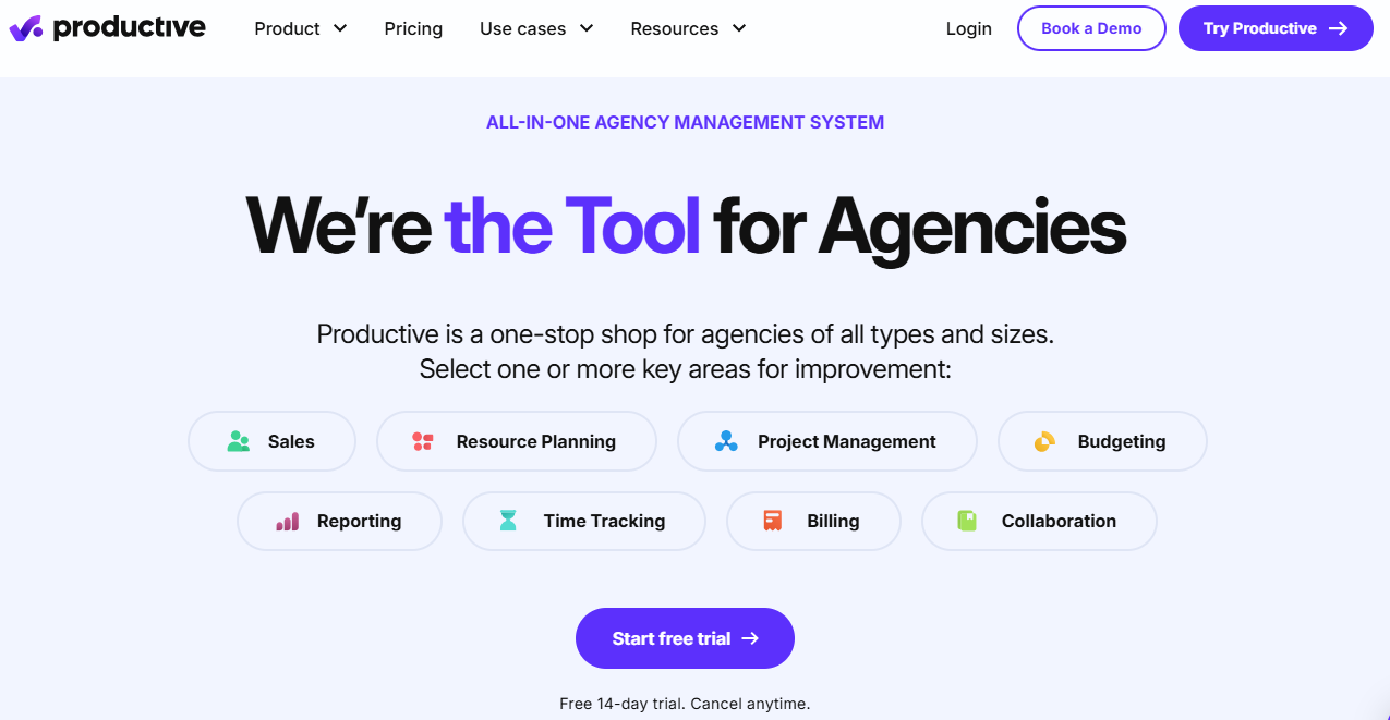 Screenshot from productive.io, November 2024
12. Skype
One of the greatest challenges for homepages is to resonate with a varied audience effectively.
Skype handles this dilemma extremely well through a dominant audience message, supplemented by very clear and distinct alternative audience content assets.
Varying this based on trends and related data ensures every core persona receives initial verification to remain actively engaged on the website.
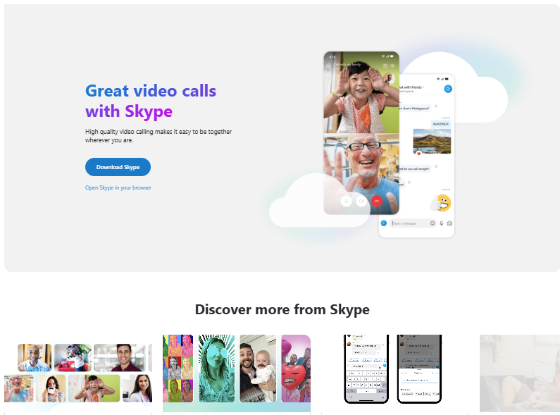 Screenshot from skype.com, November 2024
13. Uber
It takes a strong brand and confidence in user trust to present a homepage that is dominated by action-taking over value proposition.
Uber pre-scroll is 100% action-orientated, enabling the quickest route to booking prior to any conflicting messaging or related distractions.
The assumption is that if you land on the Uber site, the only thing that matters is getting you from “A to B” and servicing that intent to book above all else – and it works.
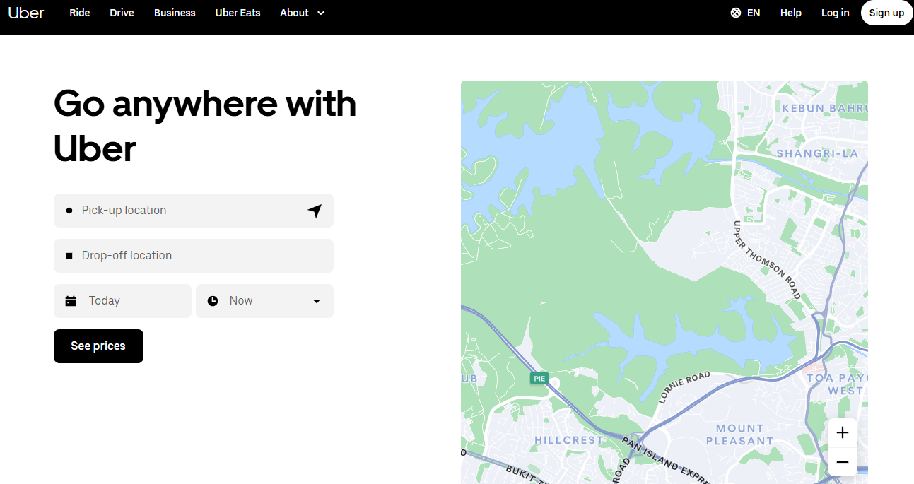 Screenshot from uber.com, November 2024
14. Dropbox
The simplicity of design and clarity of messaging are consistent throughout many of these examples. For a homepage, that is often a core challenge, as well as an aspirational goal.
In this example, headlines are emotive, and supporting statements are clear.
Mixed media walkthroughs of the service provide a trial of the solution without the need to sign up for one. It’s a great example of shortening the distance to purchase/use.
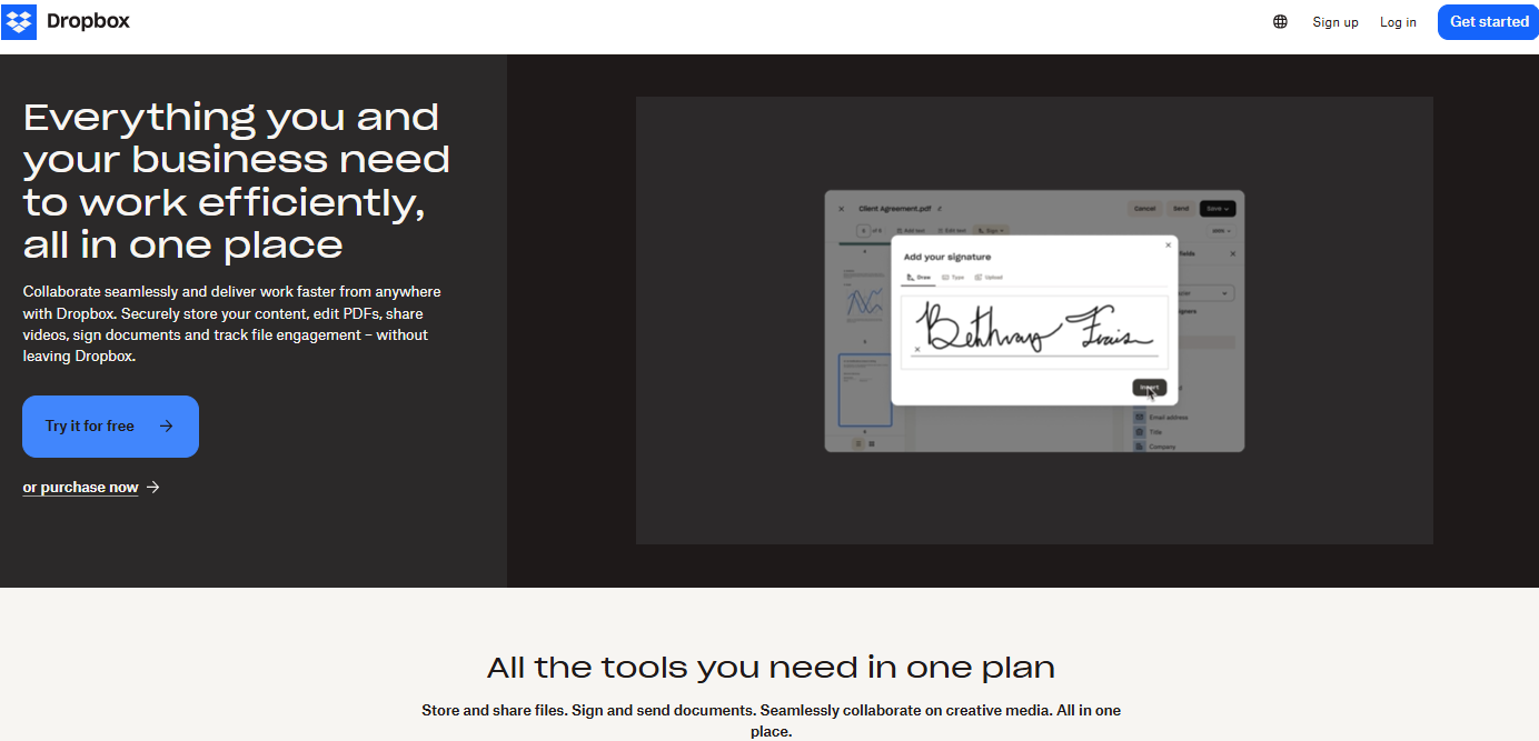 Screenshot from dropbox.com, November 2024
15. Allen Carr’s Easyway
When it comes to Your Money Your Life (YMYL) industries, homepages have additional challenges.
First, trust needs to be ever-present and supported by statistics without detriment to the brand’s style and tone.
Next, direct reinforcement of success, case studies, and audience associative needs are higher. And providing a positive outlook on tougher topic areas is far from easy.
This homepage example manages to cover all these areas plus more.
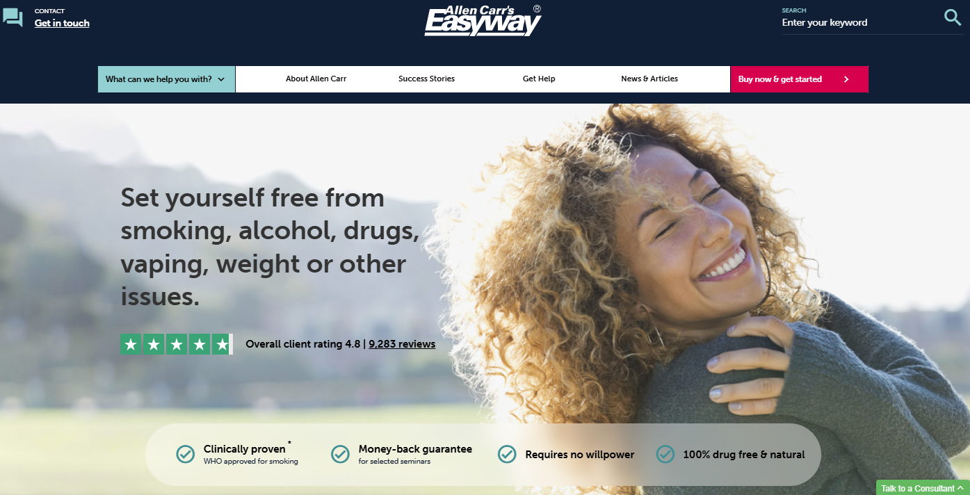 Screenshot from allencarr.com, November 2024
16. NineFeetTall
When companies provide transformation and change, like in this example, you have to balance data and justification from the outset.
The homepage acts as the roadmap from now to the near future and requires expert guidance without information overload.
Every segment of this homepage example contributes toward this journey, empowering people to learn fast and take action sooner.
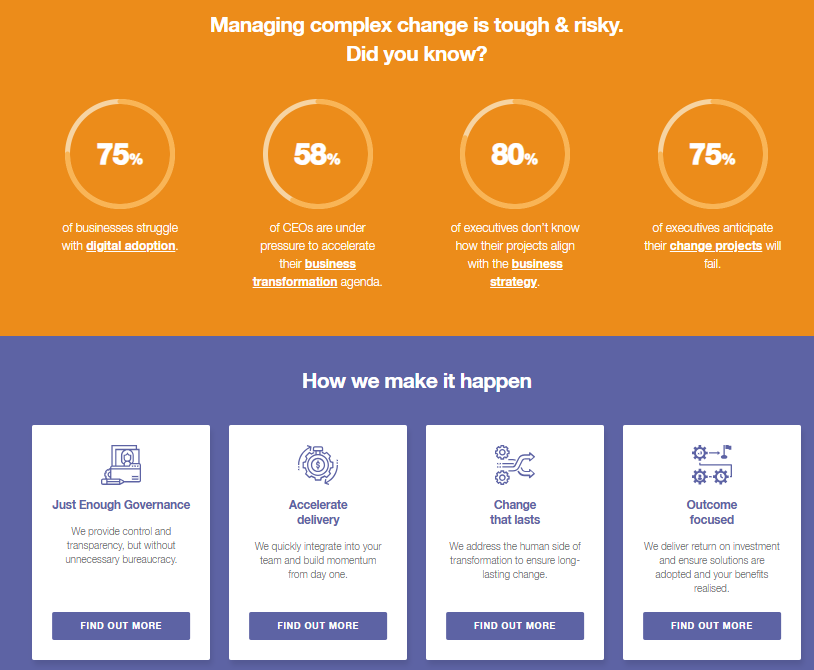 Screenshot from ninefeettall.com, November 2024
17. NHS
Websites that provide emergency help and support must reinforce trust, provide immediate access to contact, and solve problems from the first meaningful homepage interaction.
Visually, the homepage needs to drive action-taking and fuel the right choice to minimize already stressful situations.
Considering the vast array of people using emergency services like the NHS, intuitive and simple design comes into play with clear, concise content.
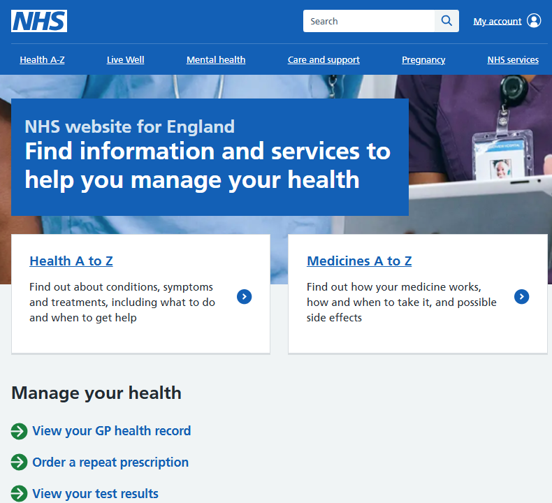 Screenshot from nhs.uk, November 2024
18. WeChat
Named one of the world’s strongest brands, the app’s homepage shows the opportunities to change the status quo with design and focus on brand-led power and positioning.
The navigation placement and impact on the page versus the streamlined and dominant CTA is an interesting approach.
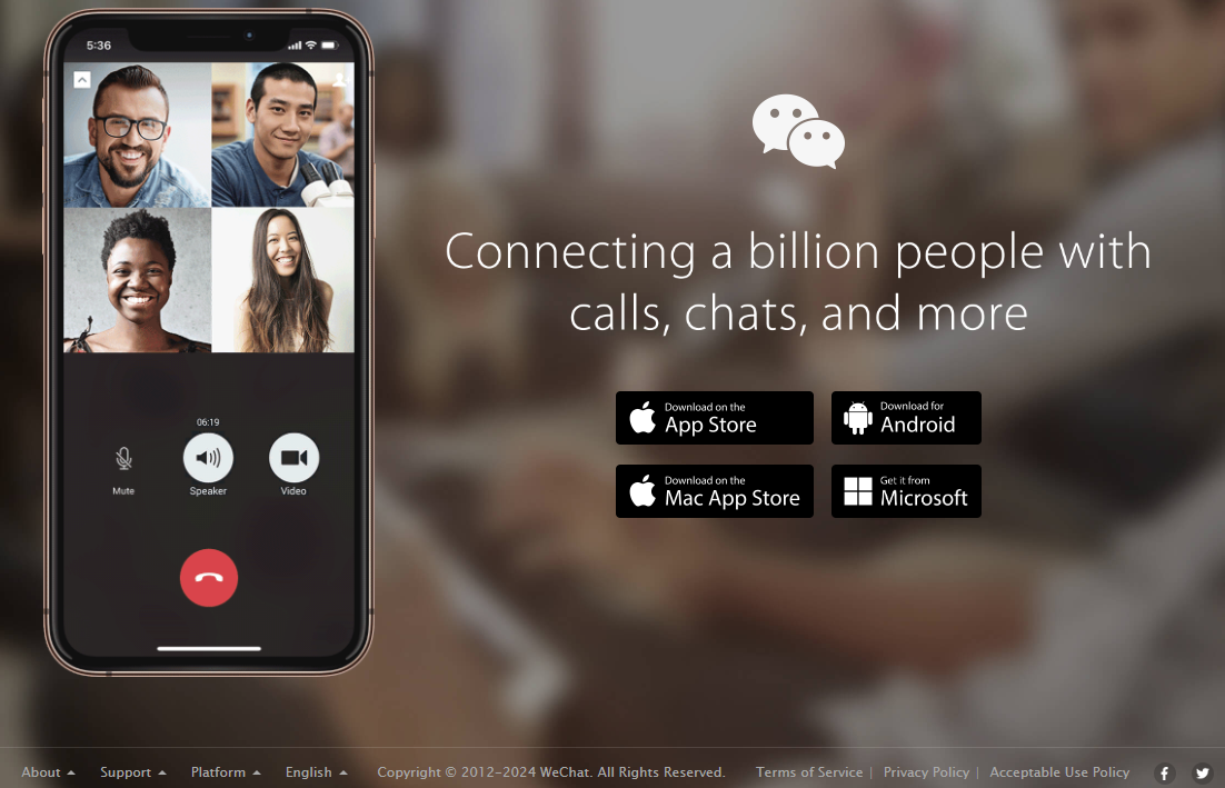 Screenshot from wechat.com, November 2024
19. Colgate
For established and traditional brands, the homepage can present a complex range of choices.
One of these is how to remain relevant with existing audiences while looking to grow visibility with new people in fresh ways.
Colgate achieves this with a combination of trust and visual reinforcement.
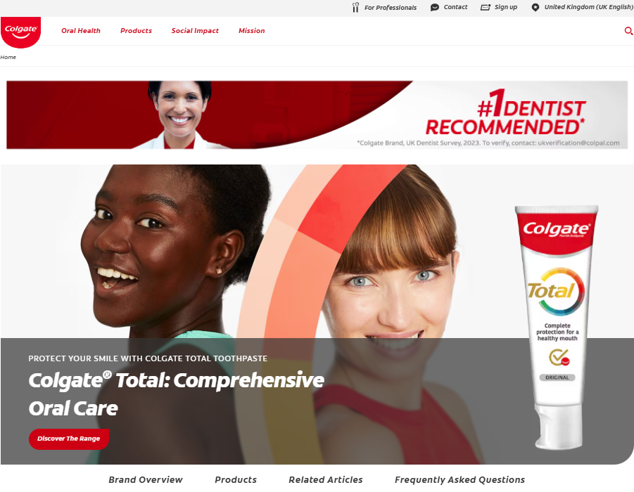 Screenshot from colgate.com, November 2024
20. Basecamp
The Basecamp homepage jumps straight into solving the main pain point of its audience.
This is then supported by segments that all actively contribute to the purpose of Basecamp as a service and nudge the user towards purchase.
This journey is without added clicks or engagement required – it’s a complete conversation on a single page:
- The headline positions the brand and service.
- The segmented homepage tells the story of why you may invest in the service.
- The dominant CTA jumps out of the page.
- Homepage screenshots provide an instant demo of the solution in action.
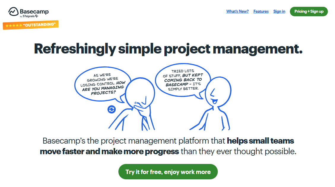 Screenshot from basecamp.com, November 2024
21. Time
A media site’s user base has high standards and expectations for creative, fast, and functional websites.
This homepage example from Time supplies easy-to-digest content while keeping text levels to a minimum.
The active use of white space is refreshing, as are the limited CTAs and removal of advertising.
The use of image, media, and text interaction supports audience preference and all device action-taking.
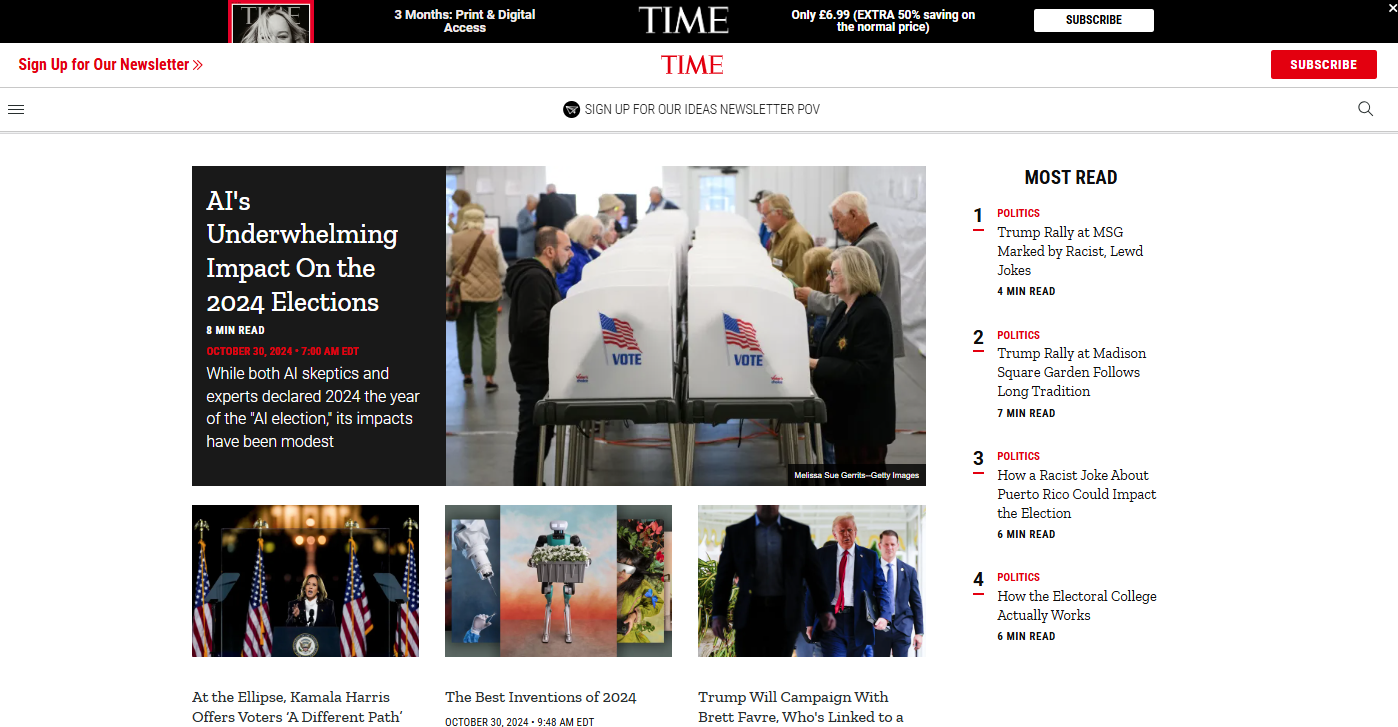 Screenshot from time.com, November 2024
22. Ocado
Large retail sites have to cram in many potential and often competing triggers to drive action and speed up access to the endpoint.
User tolerance levels for online shopping are very tough to meet, plus you are catering to a variety of audience awareness and trust.
Ocado manages to build in quick access CTAs, clear trust signals, and simple steps to purchase without cluttering the page or pulling the user into conflicting directions.
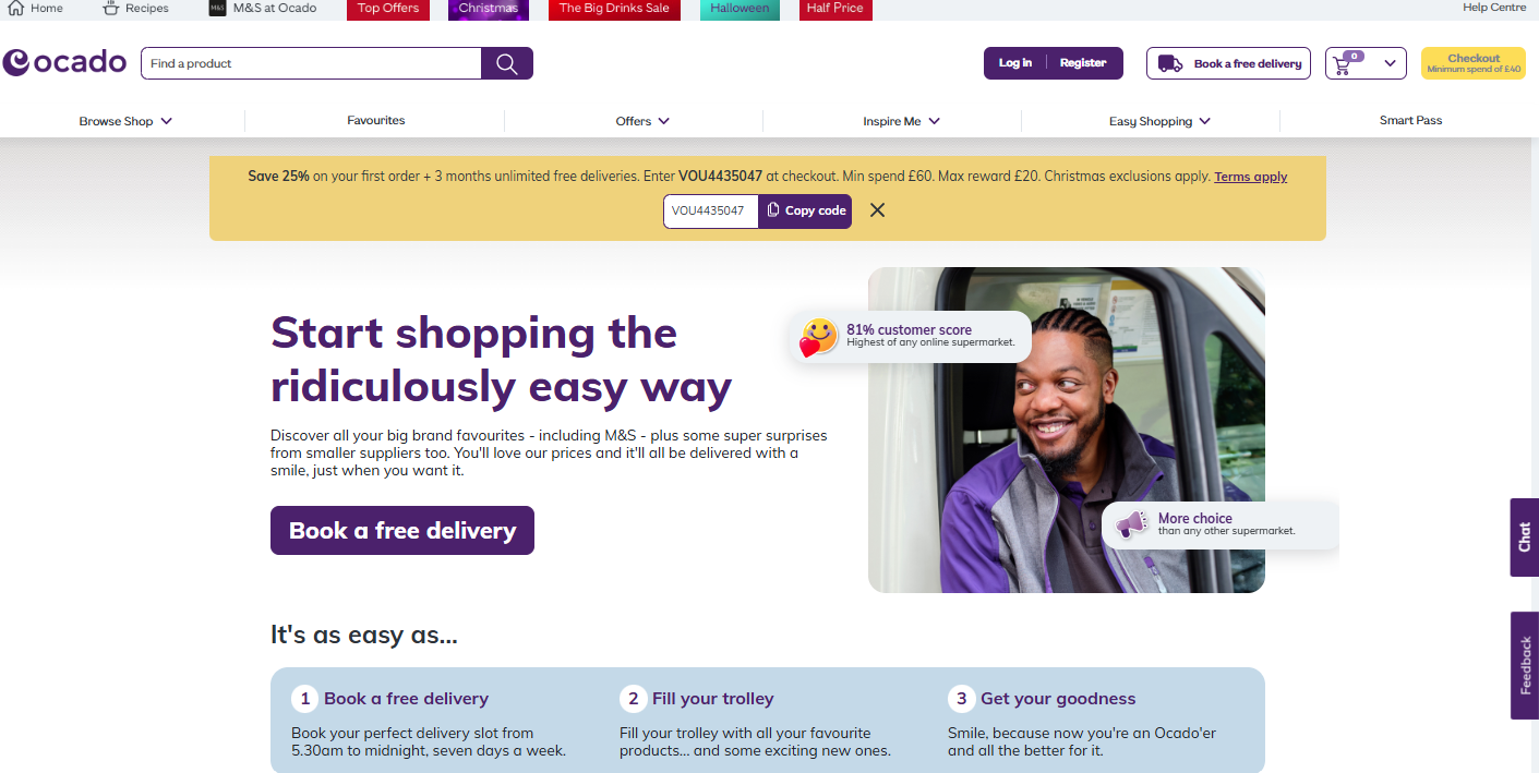 Screenshot from ocado.com, November 2024
23. Trivago
Comparison websites can feel like a bombardment of CTAs and promotional offers.
The Trivago homepage provides a relaxed, easy, and intuitive approach to booking that removes some of the complexity and time for the user.
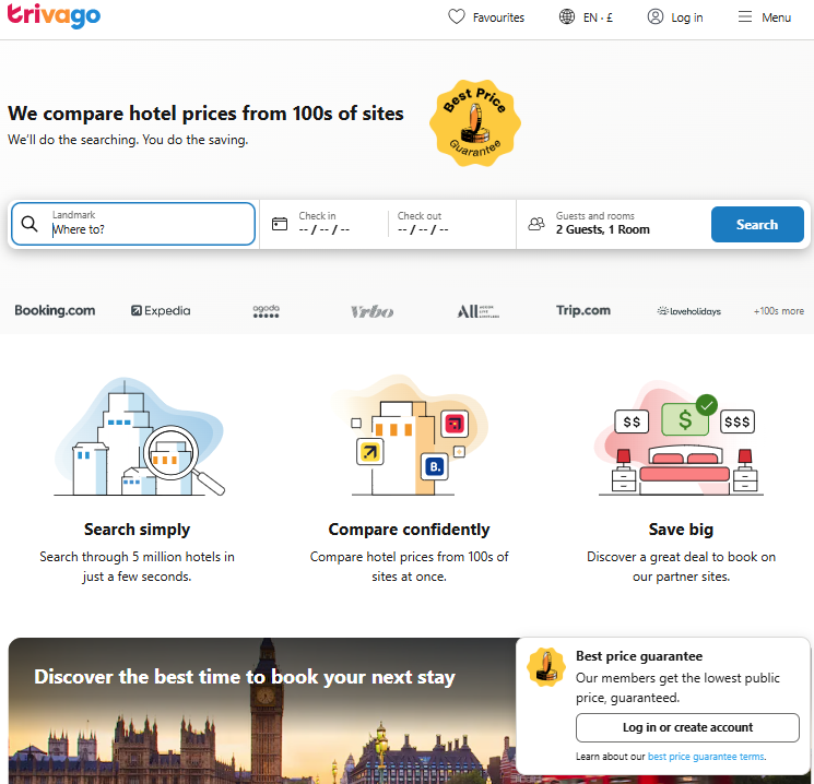 Screenshot from trivago.co.uk, November 2024
24. eBay
From a data-driven and personalization stance, sites like eBay need to be present in the best examples of homepages.
Data is at the center of the design choices and content provisions and is frequently refined to bring the user closer to their perfect next buy, whether they are aware of it yet or not.
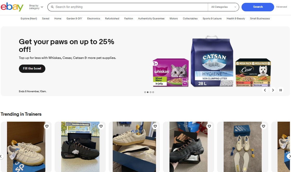 Screenshot from ebay.co.uk, November 2024
25. Imgur
Everything on this homepage shouts out fun, interaction, and enjoyment. Its core functionality is to make things simple to click, watch, and engage.
Yes, there is some quite intrusive advertising, but there is also an element of new audiences meeting nostalgia here with the early age of the internet ad space.
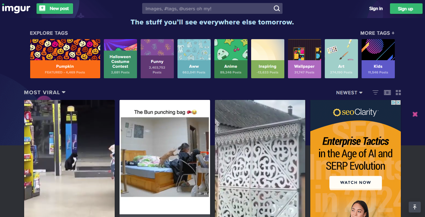 Screenshot from imgur.com, November 2024
What Should A Homepage Include?
First and foremost, the homepage needs to represent your brand values and proposition. Reinforcing the unique culture of your business and supporting brand recognition.
This is achieved through every piece of content, imagery, and prioritization of messaging on the page.
As your shop window, you need to present the most relevant messaging and CTAs that will resonate with your audience and drive them to click further into your website content and their unique conversion journey.
Visual elements should be of high quality, not competing with other on-page items, and making it simple for people and search engines to understand the core purpose of your site and what your brand represents.
Trust should be set from the outset. This includes star ratings and brand narrative through case studies and related social proof.
Your homepage needs to set out the key content assets and products/services that are the cornerstone of your business.
As with all pages on the site, the user experience is of even greater importance to the homepage. Their engagement should be fast, intuitive, and accessible for all content and devices.
And while there are other areas too, don’t forget to have readily available contact details that reinforce the brand identity, personality, and company values.
A Homepage Is A Showcase And A Signal Of Trust
The homepage is often the first interaction users have with your brand, serving as a critical entry point for visitors.
Your homepage is your shop window, showcasing your most valuable content and differentiating your brand from competitors while guiding users toward taking their first actions on your website.
There are many key functions that a homepage plays, including:
- First Impressions: Creating an impactful introduction to the brand.
- User Journeys: Drives visitors into conversion funnels.
- Content Discovery: Helps users find products and services fast.
- Incentives: Highlights promotions to encourage clicks and engagement.
- Trust Building: Builds expertise and authority through social proof and related trust signals.
- Comprehensive Coverage: Addresses topics without dedicated pages as a catch-all for search and users.
- Audience Resonance: Reflects brand positioning and core values.
There are many essential components of a successful homepage, lots of which can be seen in the 25 best examples of homepages shared in this post.
To recap them, you should be thinking practically about:
- Brand Representation: Clearly showcase your brand values and unique culture through the content and imagery you provide.
- Relevant Messaging and CTAs: Prioritize calls to action that resonate with the audience, but limit them to a maximum of three to avoid conflicting attention demands.
- High-Quality Visuals: Make sure that all visuals enhance understanding without competing for attention, and that they are unique and of high quality.
- Trust Signals: Include reviews and ratings, case studies, and social proof from the outset so people can see a clear association with your existing and target audience types.
- Key Content Assets: Highlight essential products and services that are cornerstones of your business offering.
- User Experience: Focus on fast, intuitive, and accessible navigation and content in all its forms and for all devices.
- Contact Information: Give easily accessible contact details to reinforce brand identity.
More resources:
Featured Image: eamesBot/Shutterstock
 seolounge